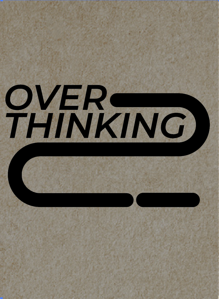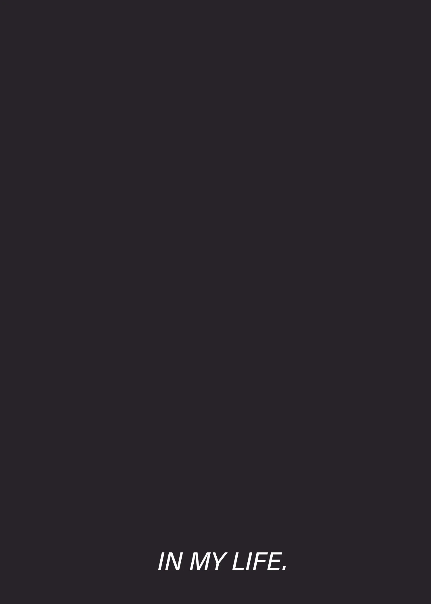
Currently Overthinking Everything In My Life
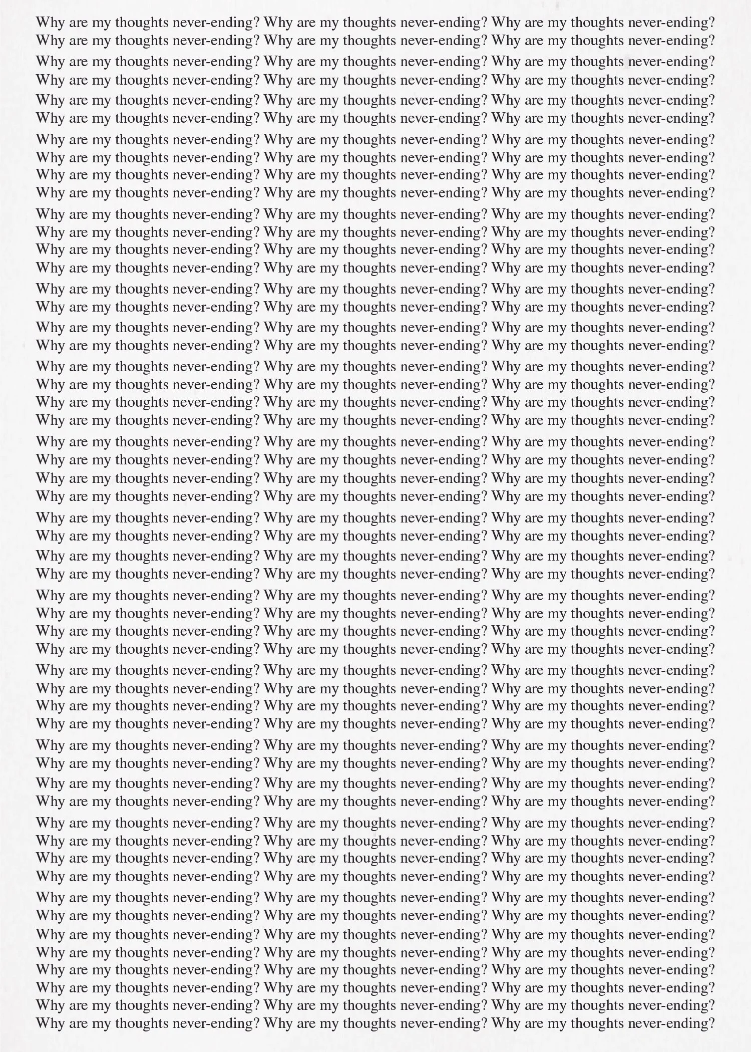
Six simple yet complicated words that never seem to leave my mind. The goal of this project was to tell my life story in just six words while exploring typographic expression and design constraints, including 3D elements, user interaction, and movement. I chose the phrase “currently overthinking everything in my life” because it’s a feeling many people relate to on some level. Because I have severe anxiety, it's something that consumes me a lot.
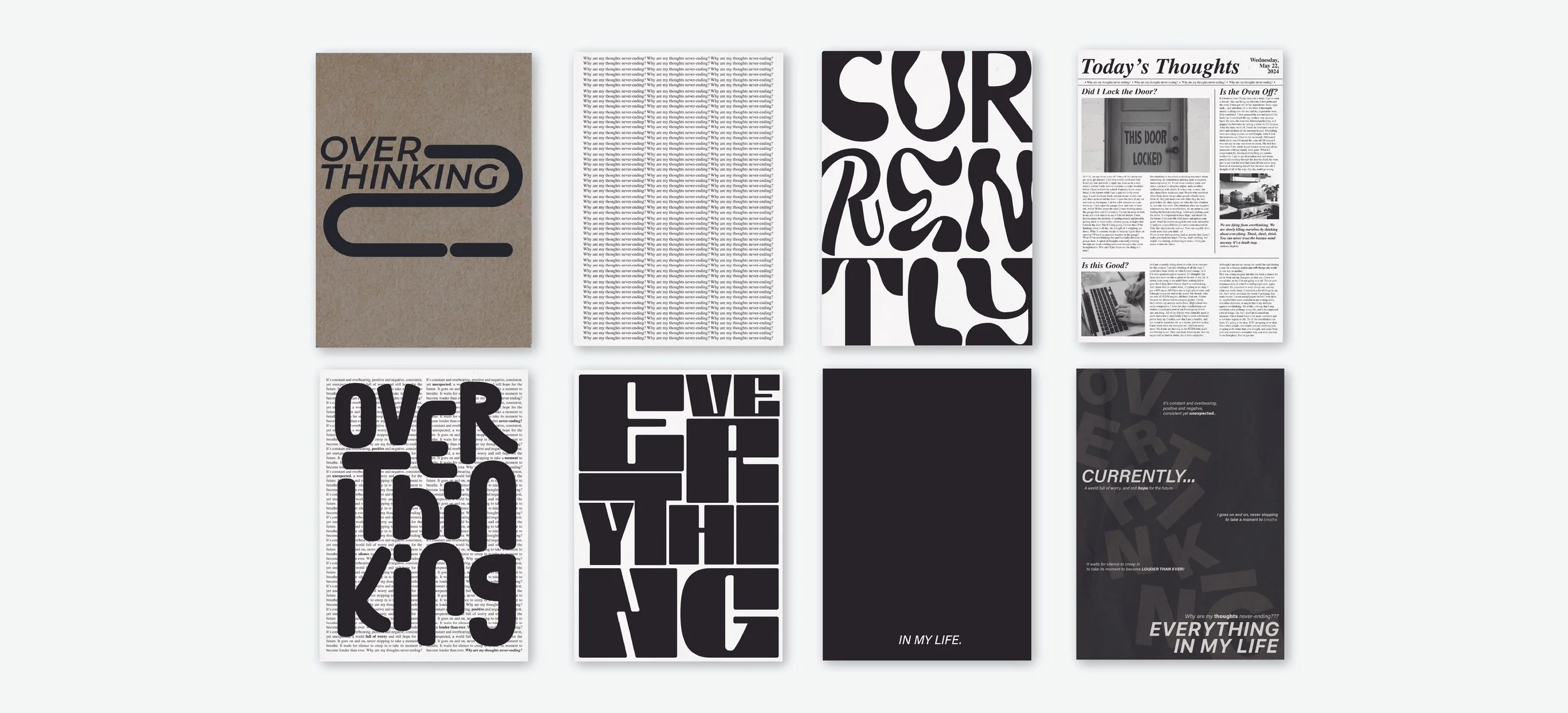
This project became an opportunity for me to take risks, be bold, and not get caught in the loop of Is this right? or Does this fit within the parameters? Each new constraint served as an invitation to experiment, try unfamiliar techniques, and refine my work with every iteration. By the time I reached the final critique, the project had become not just a design exercise, but a meaningful exploration of how creative experimentation can coexist with overthinking, and sometimes even quiet it. The finished project was to have three posters conveying the same message, and an accompanying short book.
A note on color choice: I started this project in full color, and then realized that this isn’t what the memoir needed; it needed to have stark contrast with pops of color to make it more mature and serious. I tended to stick to a black and white color palette, so going into the book, I had a theme, but I did experiment with colors in other ways.
Six Word Memoir
FOCUSES
Typography
Layout
Hierarchy
Color Theory
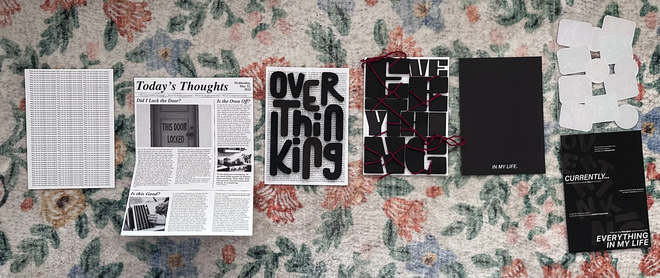
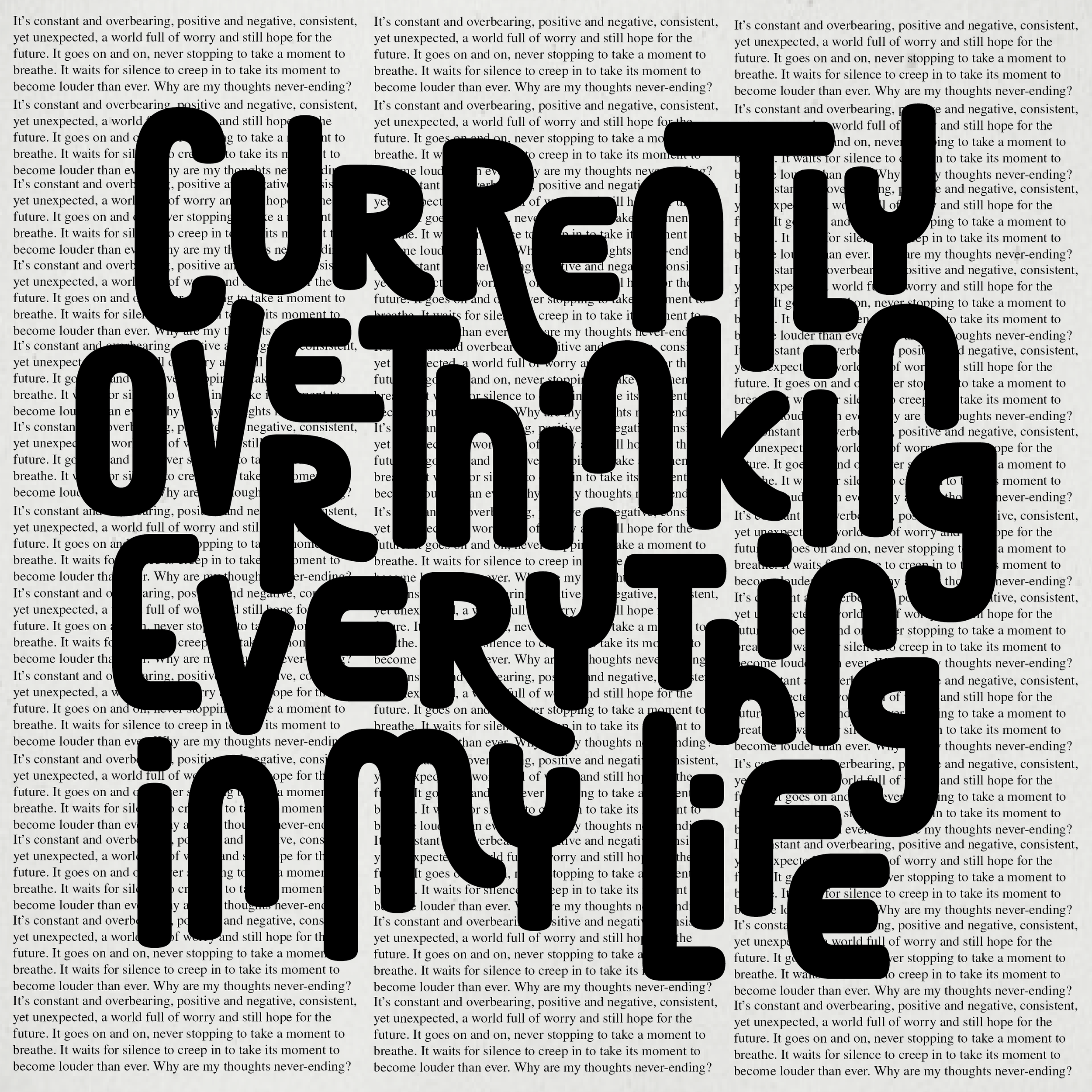
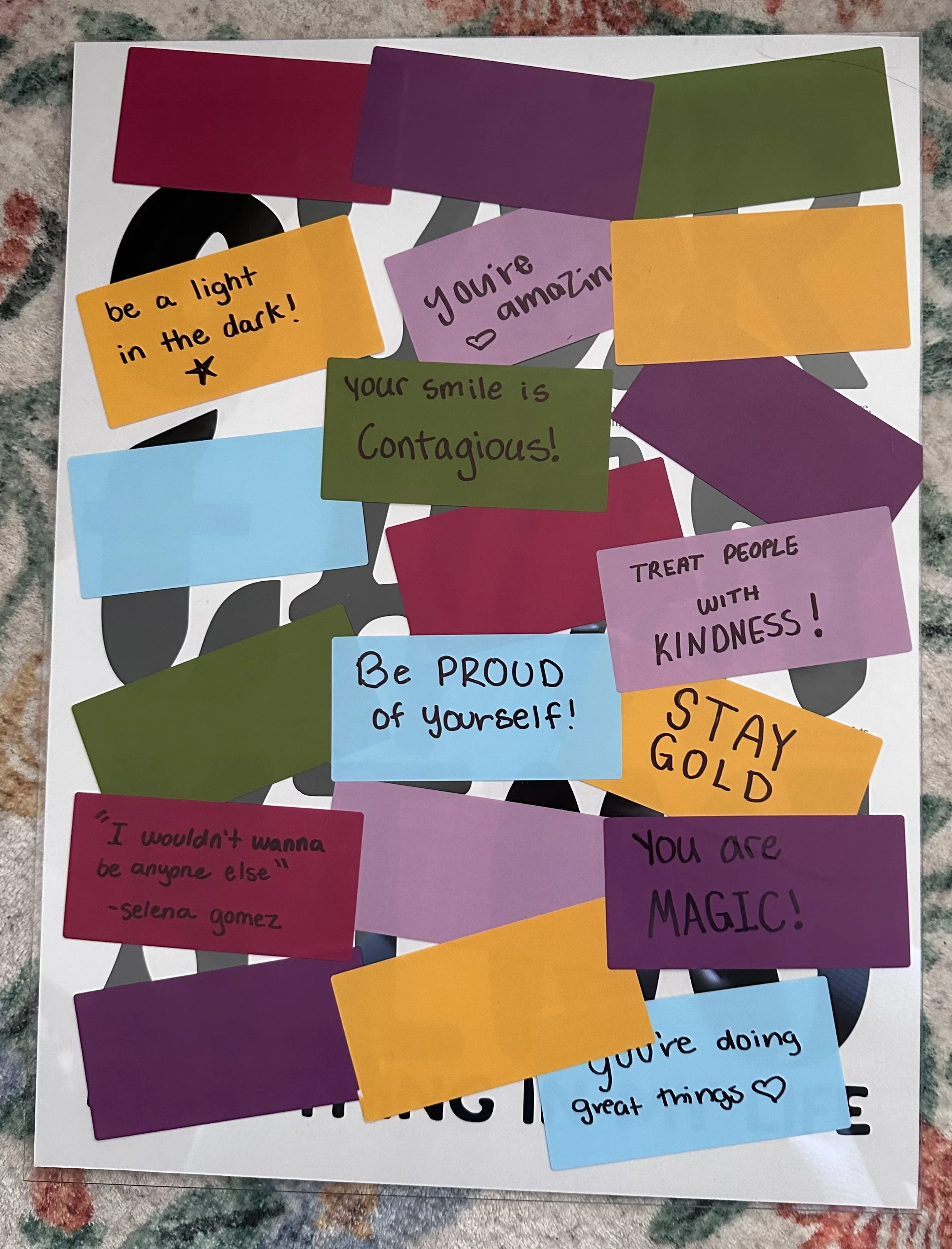
The left most poster embodies user-interactivity, and engagement (as you can see in the next section). The goal was for the user to add a positive note, and keep adding them until overthinking was completely covered, and instead, it showed only positive thoughts. Additionally, I added another interactive moment in having a clear pane of glass. This showed that even through those happy thoughts, on the inside there is always some form of overthinking, no matter how hard you try to cover it up.
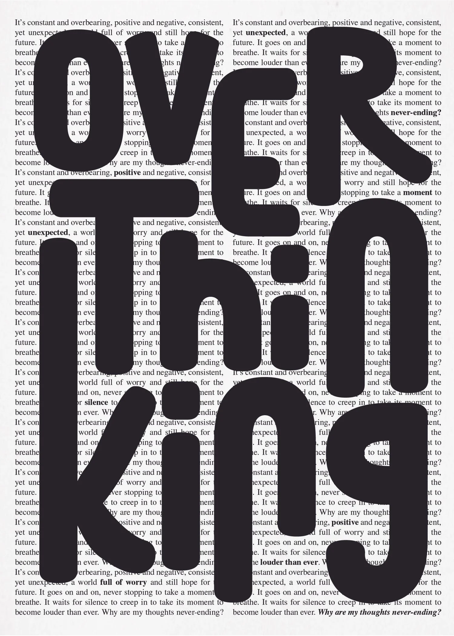
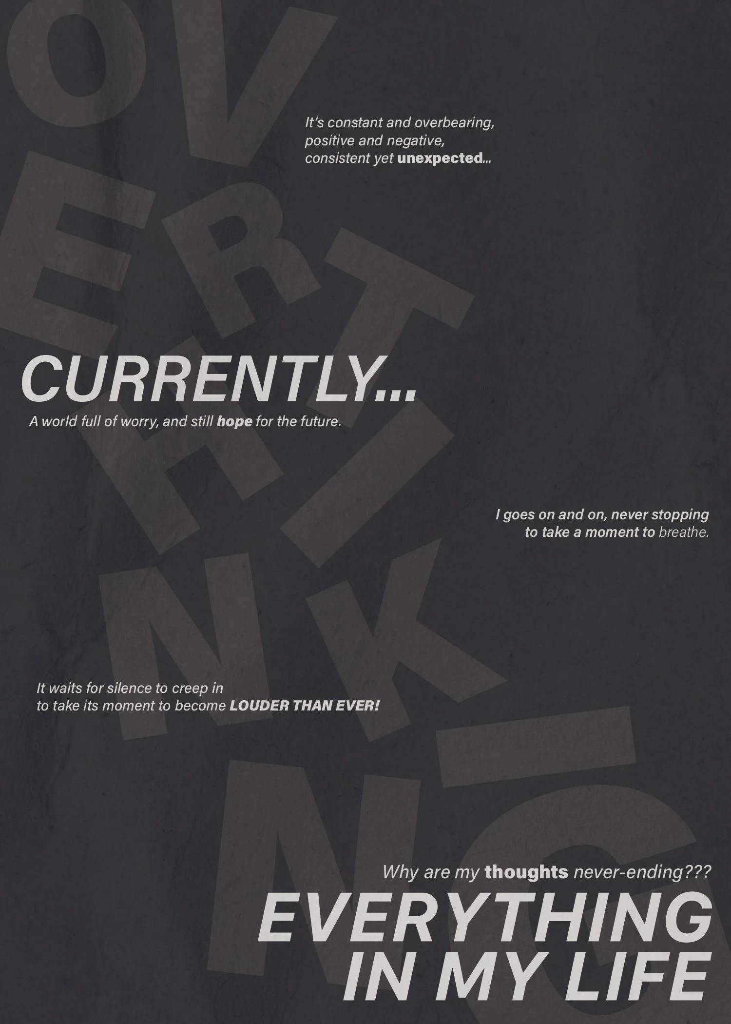
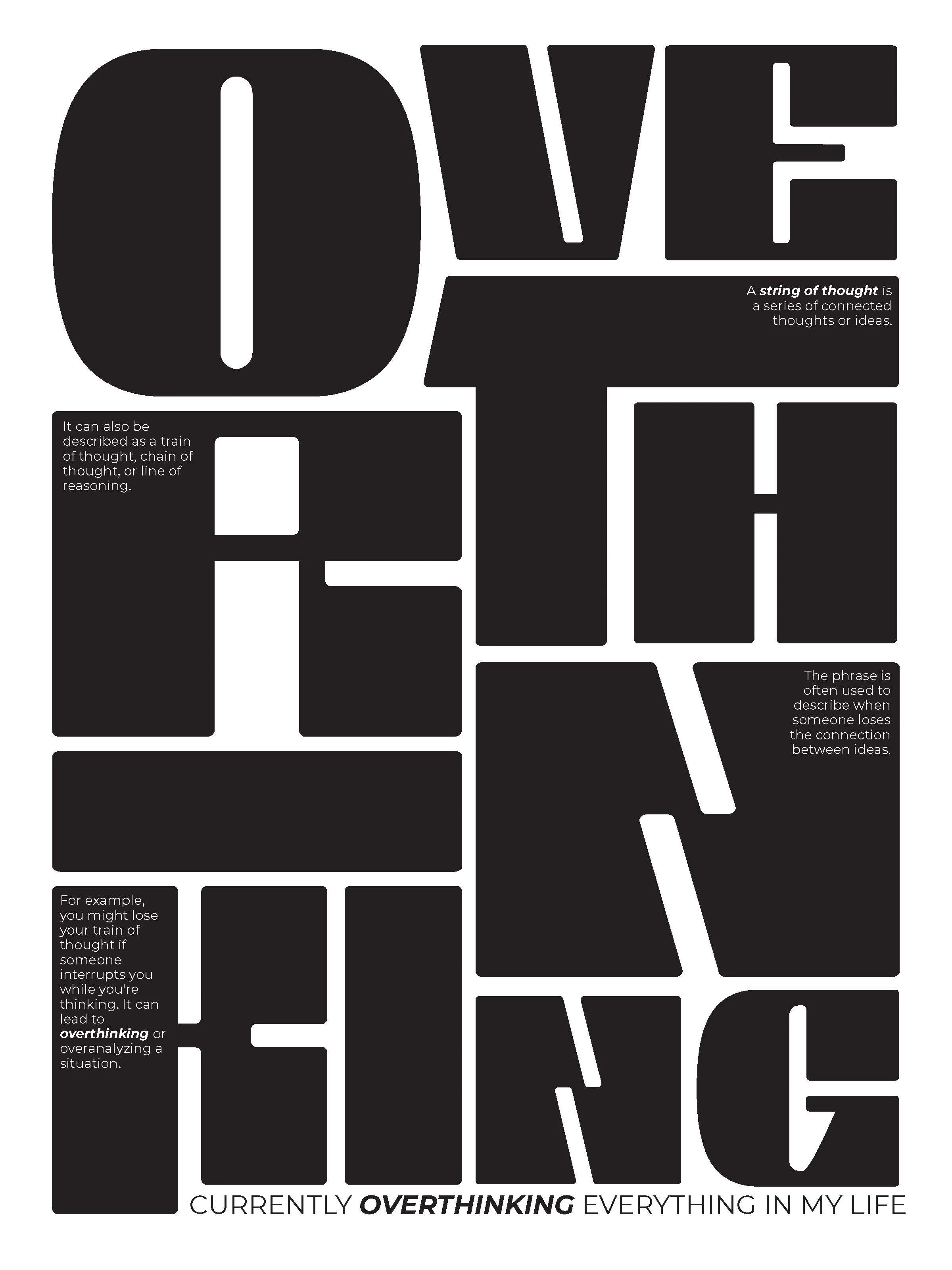
For the middle poster focuses on the element of 3d. For the 3d effect, I created two layers of space that the letters could live on- alternating them so it stood out better. This helped me experiment with type as it becomes a form. I also boldened some of the words in the back to make them stand out more. To add texture, I used a hard bristled brush and painted glue over the top on some of the letters. I also experimented with a sponge, and adding ink on some of the letters.
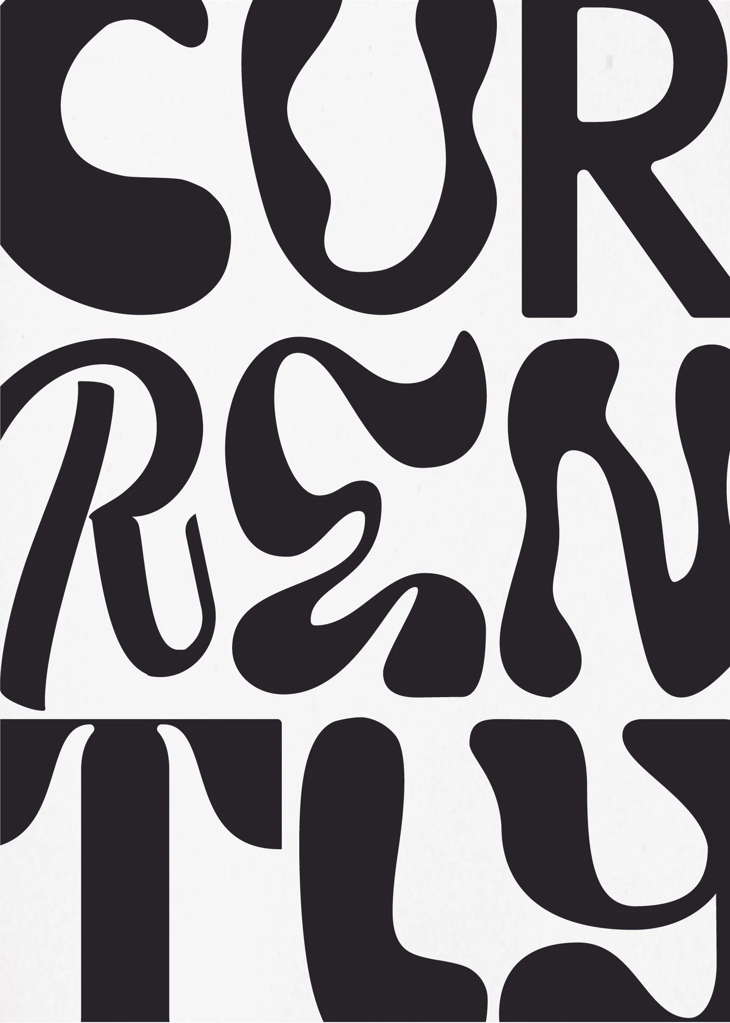
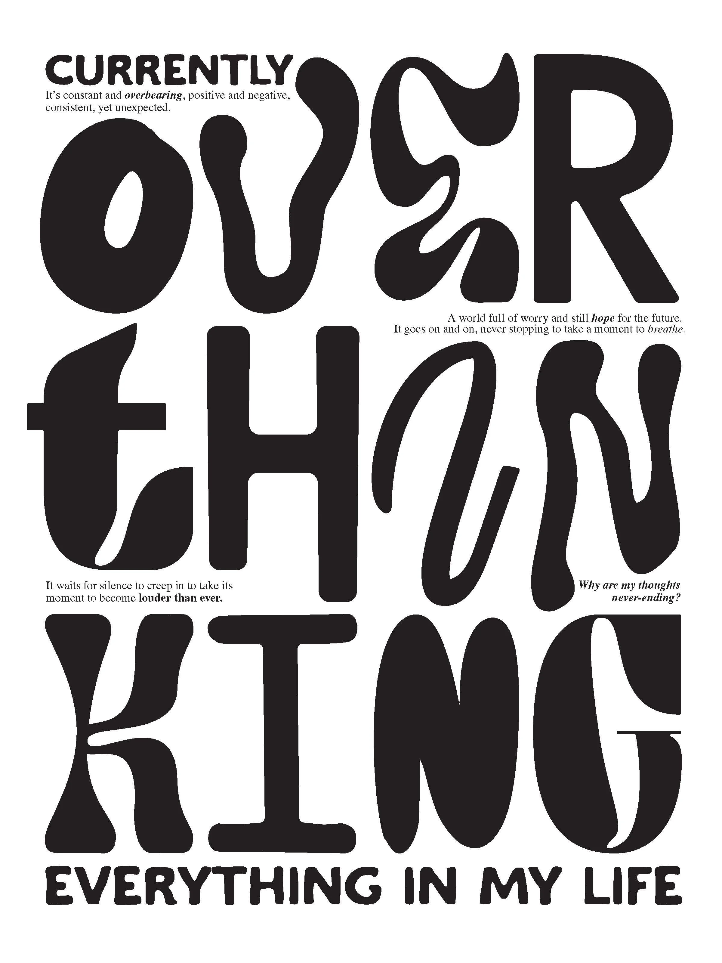
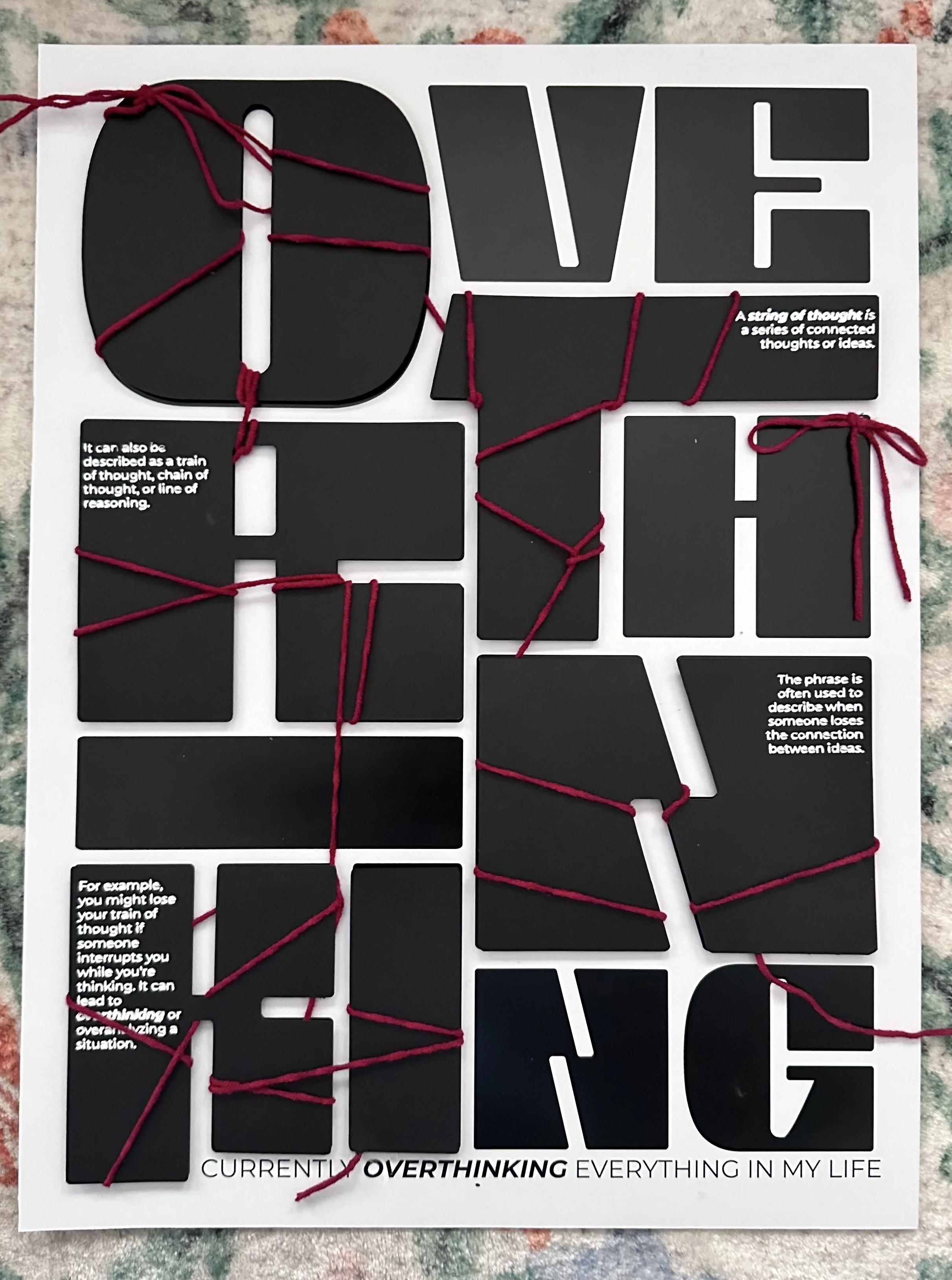
The right most poster focused on texture or material relating to the meaning of the memoir. I chose string- like a string of thought (shown in the next section). I changed the additional words for this to explain what a string of thought is, and how it relates to overthinking. I experimented with 3d letters, as I felt it would be easier to wrap string around them. I decided to only do some of the letters 3d to draw more attention to the layers.
Posters
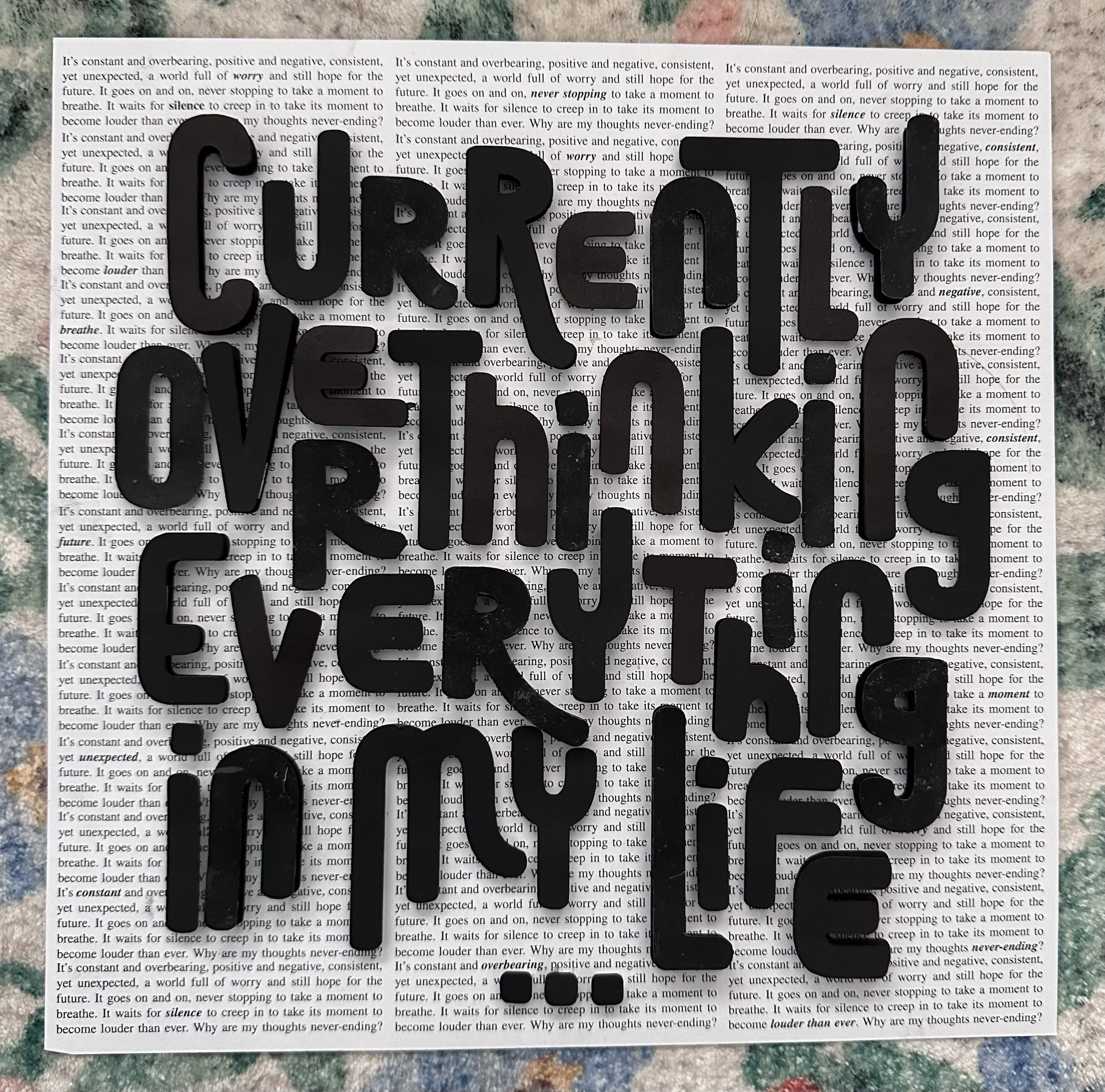
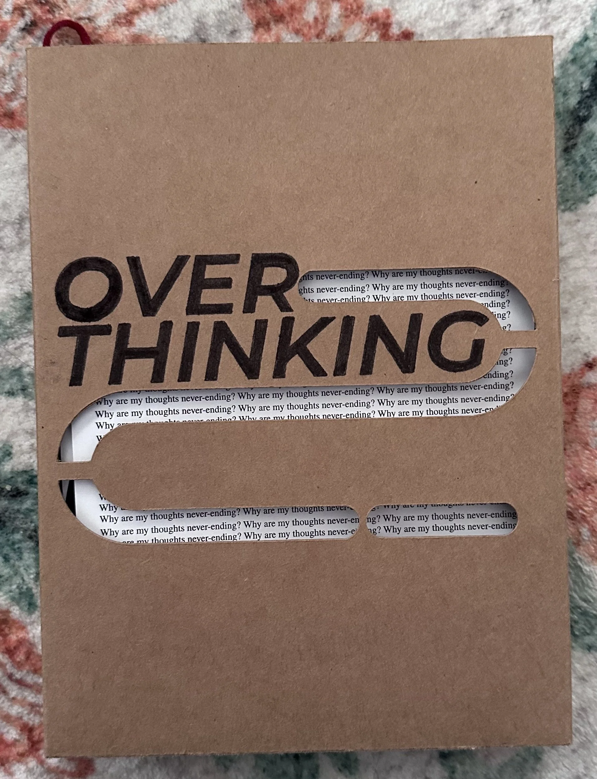
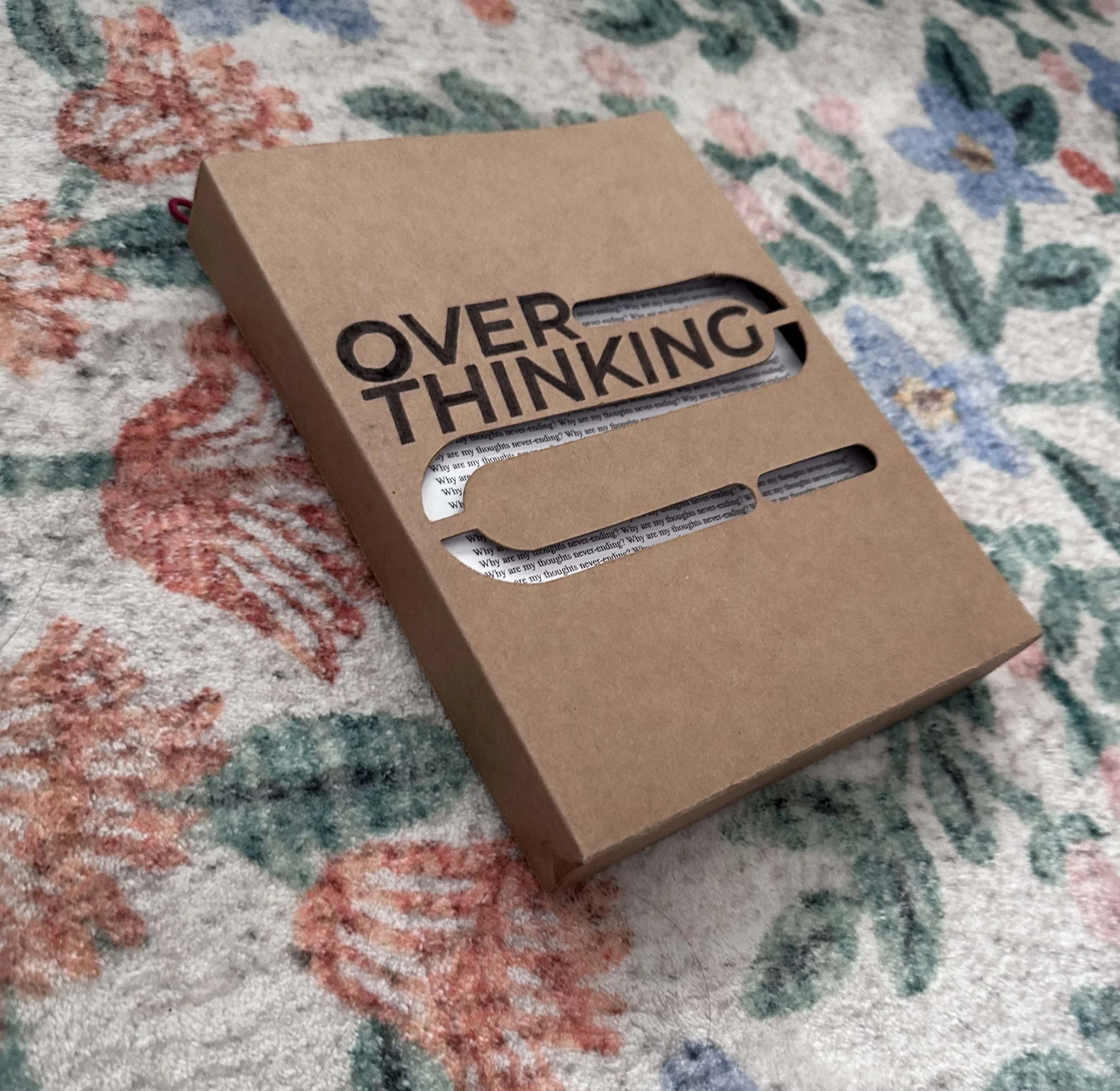
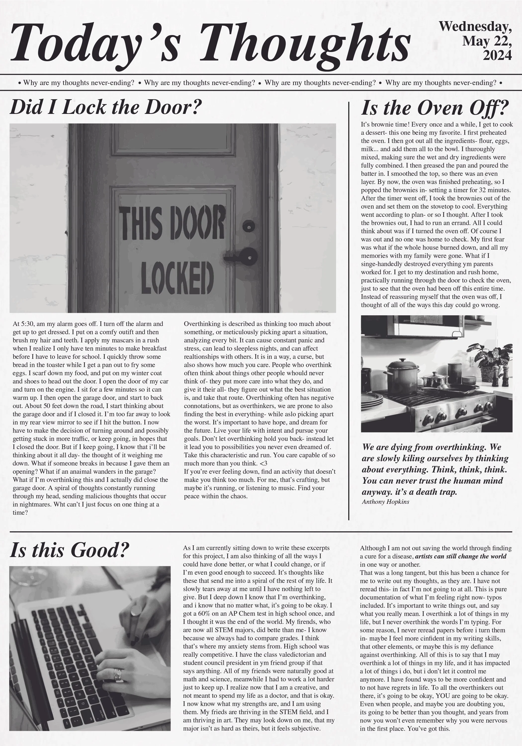
For the booklet, I chose to use five of the posters in my book. In class, I saw a box example, and since I had a lot of 3d elements, I thought it would be easier if the user could pull each piece out individually and that they could lay on each other in a stack instead of being bound on one side, because the book may have become lop-sided. I decided to look at snapshots from each poster to tell more of a story, instead of repeating the same phrase over and over, but still connected them through style and color. This created more of a continuous narrative. At the end I include a completed form to bring it all together. One new element I added was that the second poster (currently) opened like a card into a newspaper (like current news). Its a deeper look into how I specifically am an overthinker, and why this encapsulates me.
Booklet