
BOLD (OS FOR PEOS) REBRAND
A bold new identity designed to position an AI-powered PEO platform as modern, intuitive, and built for the future.

FOCUSES
Branding and Visual Identity · Brand Strategy · Social Design · Brand Guide · Color Theory
INDUSTRY
SERVICE
SERVICE
BRANDING & STRATEGY
TIMEFRAME
TIMEFRAME
JUNE 2026
JUNE 2026
ABOUT
BOLD is an AI-powered workflow platform designed to help PEO teams simplify operations, improve collaboration, and drive growth. The rebrand created a modern, cohesive identity that reflected the platform’s technology while giving the brand a flexible foundation to grow.
With BOLD looking to establish a stronger and more cohesive visual identity, I led the rebrand to create a brand presence that better reflected the company’s vision and technology. The new identity focused on feeling modern, confident, and approachable, while creating a flexible visual system that could communicate the platform clearly and support the brand as it continued to grow.

PRIMARY
THE CORE BRAND IDENTIFIER
The BOLD primary logo combines the brandmark and wordmark into a unified identity. Geometric letterforms communicate confidence, clarity, and scalability, reflecting the PEO platform that is both powerful and intuitive.

SECONDARY
BRAND & POSITIONING
The secondary logo pairs the BOLD wordmark with The OS for Your PEO, creating an identity statement that communicates both recognition and purpose. It is used when the brand needs to identify itself while also immediately communicating what it does.

BRANDMARK
DISTILLED IDENTIFICATION
Abstracted from the full logo system, the BOLD brandmark functions as an independent visual signal for the platform. Its geometric construction mirrors the structure of the wordmark, creating a recognizable mark that remains clear and scalable across applications.

EMPOWER PEO TEAMS WITH FLEXIBLE, AI-POWERED WORKFLOW SOLUTIONS, THAT SIMPLIFY OPERATIONS, IMPROVE COLLABORATION, AND DRIVE GROWTH.
MISSION STATEMENT
CREATE A MORE CONNECTED, EFFICIENT FUTURE FOR MODERN PEO ORGANIZATIONS THROUGH INTELLIGENT WORKFLOW TECHNOLOGY.
VISION STATEMENT
COLOR & ACCESSIBILITY
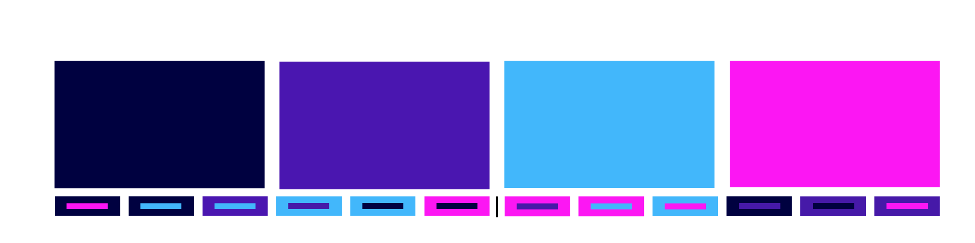
The vibrant, cool-toned color palette was designed to reflect the modernity and confidence of the BOLD brand. Using analogous colors creates a cohesive visual system while still allowing for variation and hierarchy across brand applications.
Accessibility was also a key consideration in developing the palette. At least half of the color pairings were intentionally selected to meet accessible contrast standards when tested through WebAIM’s Contrast Checker, ensuring the visual identity could remain bold without compromising readability or usability.
Left: Approved color pairings that meet WebAIM contrast standards.
Right: Color combinations that should not be paired together due to insufficient contrast.
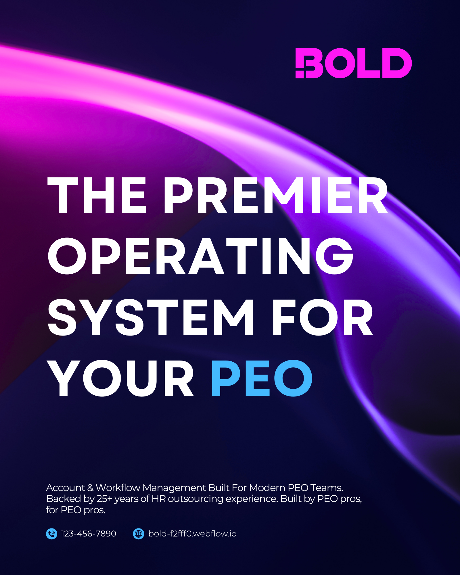
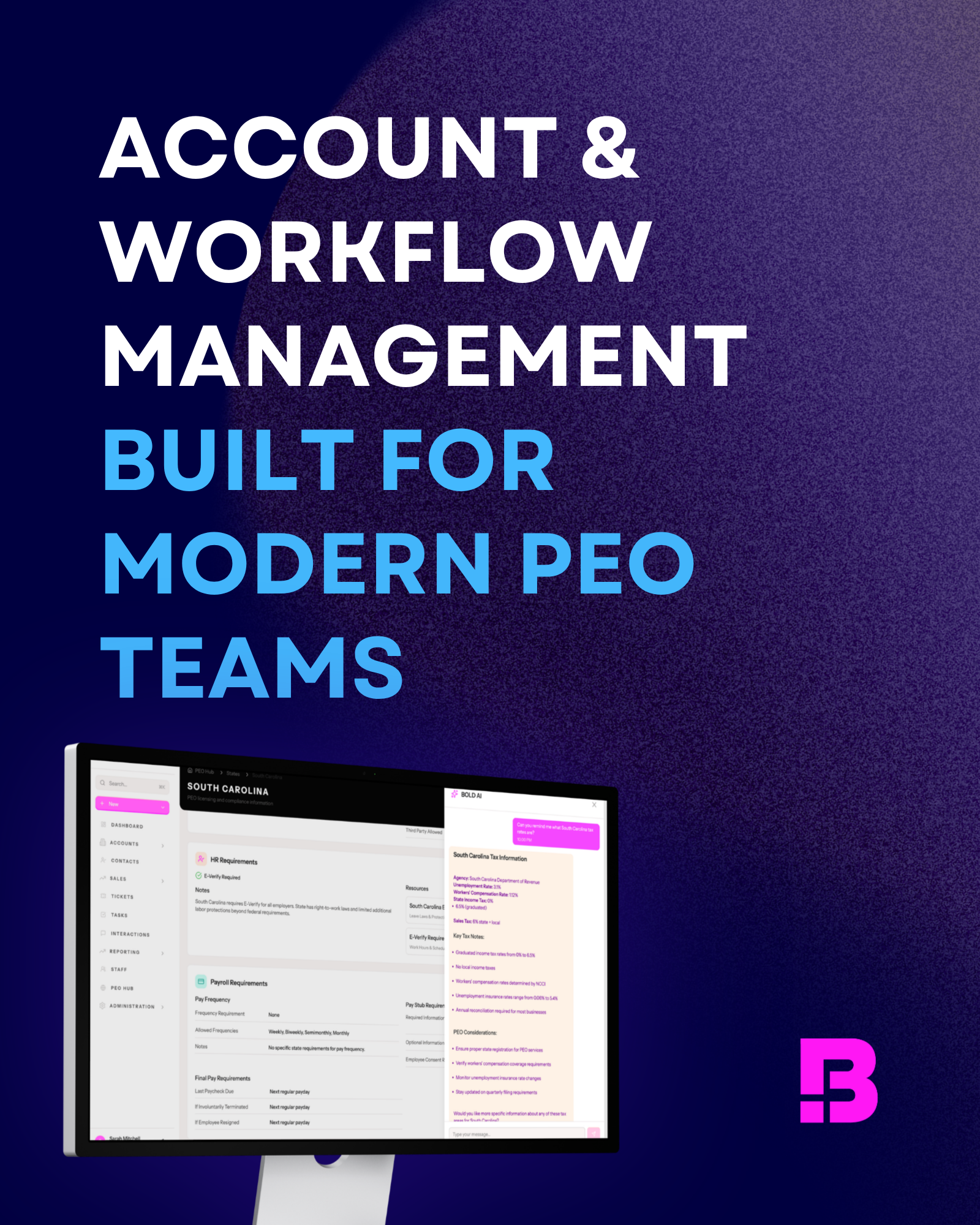
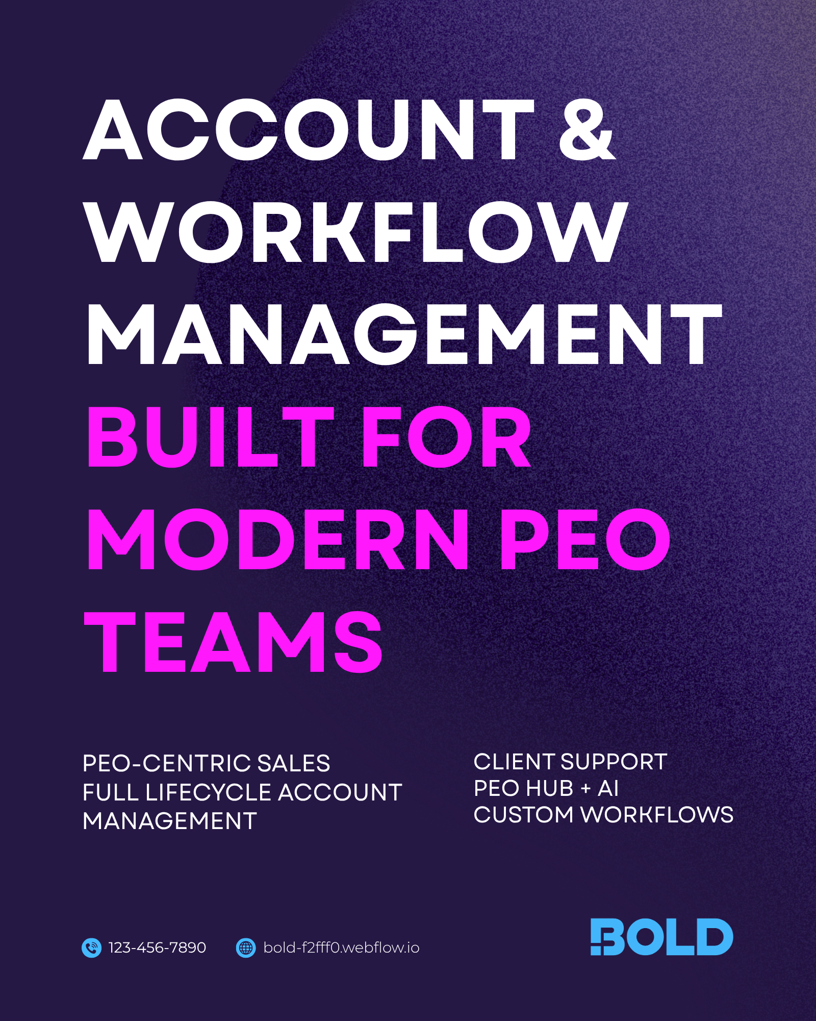
SOCIAL ACTIVATION
PROJECT CREDITS
Client
BOLD
Creative Agency
ALX
Lead Brand Designer
Katie Scaffidi
Social Designer
Katie Scaffidi
Creative Director
Angela Ryan
Account Director
Kanaka Pandit