After researching and choosing distinct aspects of a national park—Arches National Park in Utah—create a set of full-color interconnected pictorial marks and display them on a website. These marks should represent and celebrate the park’s most defining natural formations, ecological features, and cultural narratives through a unified visual system.
Geographic Wordmarks
FOCUSES
Ideation
Topic Research
Logo Set Development
Branding and Visual Identity
Color Theory
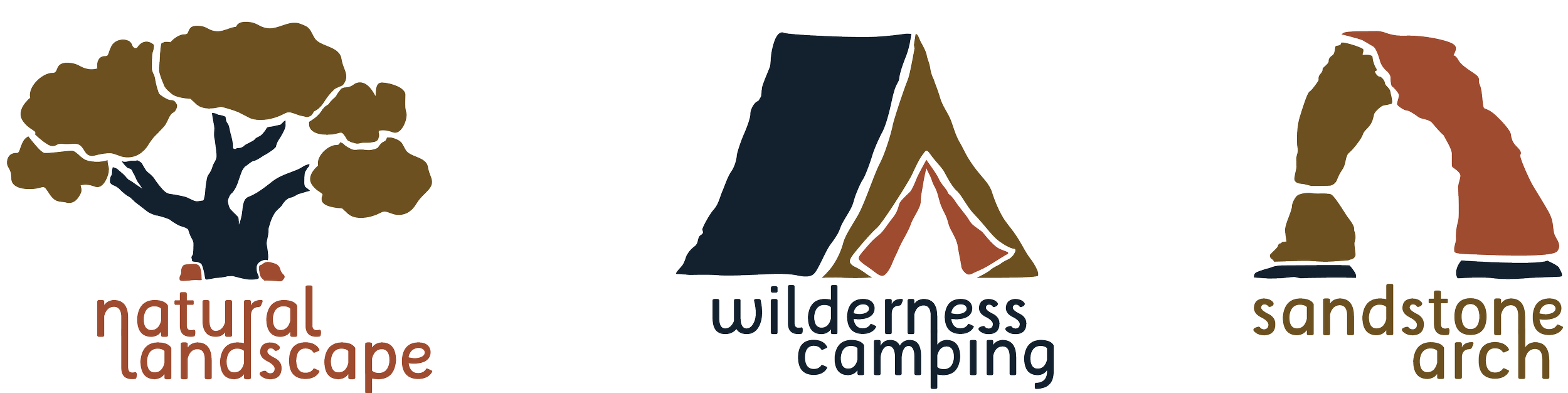
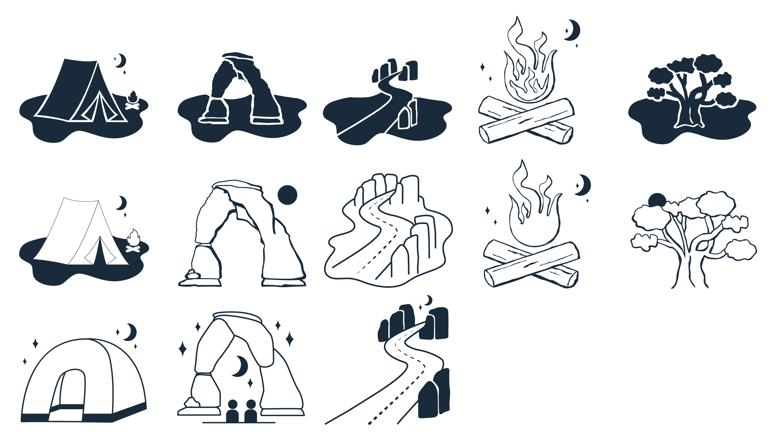
Camping is inspired by the tents visitors put up through the park as they travel. It’s a common activity, and specific areas allow bonfires, and unlit areas to watch the stars. The theme here is community and connection.
Sandstone Arch is inspired by the Delicate Arch, the most known arch in the park, although there are 2.000 natural sandstone arches throughout 119 square miles. It’s on the Utah license plate and is important to locals. The theme here is nature’s gift and attraction.
Scenic drive: There is a road that goes through some parts of the park, so tourists that aren’t able to do the strenuous hikes can still see some of the natural arches from the road.
Campfire: Taken from the idea of camping, this focuses on the nature aspect. Fire illuminates the night, so its possible to see the moon and the stars.
Natural Landscape is inspired by the Pinyon tree, one of the most common flora in the park. This exudes a naturalistic feel through its organic shapes, that together form the structure of a growing tree. The theme here is growth and nature.
Research
Design Choices: The green is the predominant color for trees and nature,, and the orange was pivotal for the sandstone arches; to branch those colors together, I offset them with a dark navy. I chose a modern sans serif font, but one that included curved lines to mimic the curve of the arches.