
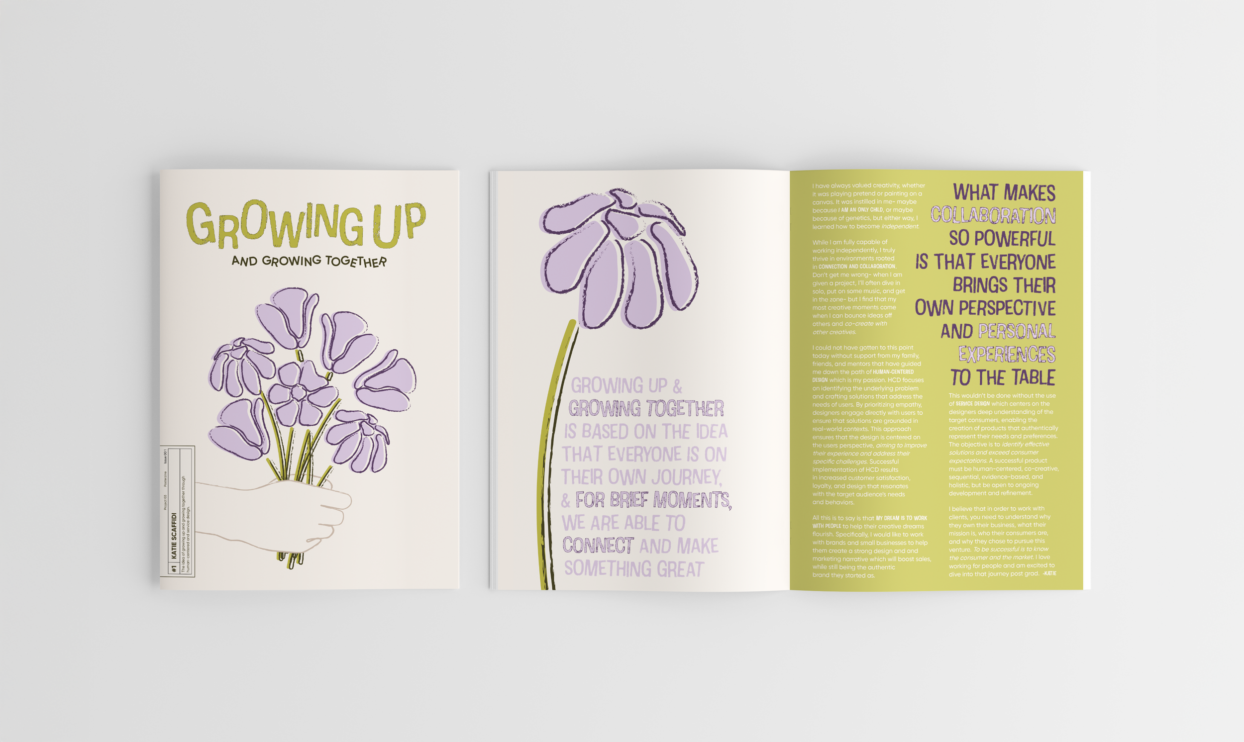
Growing Up
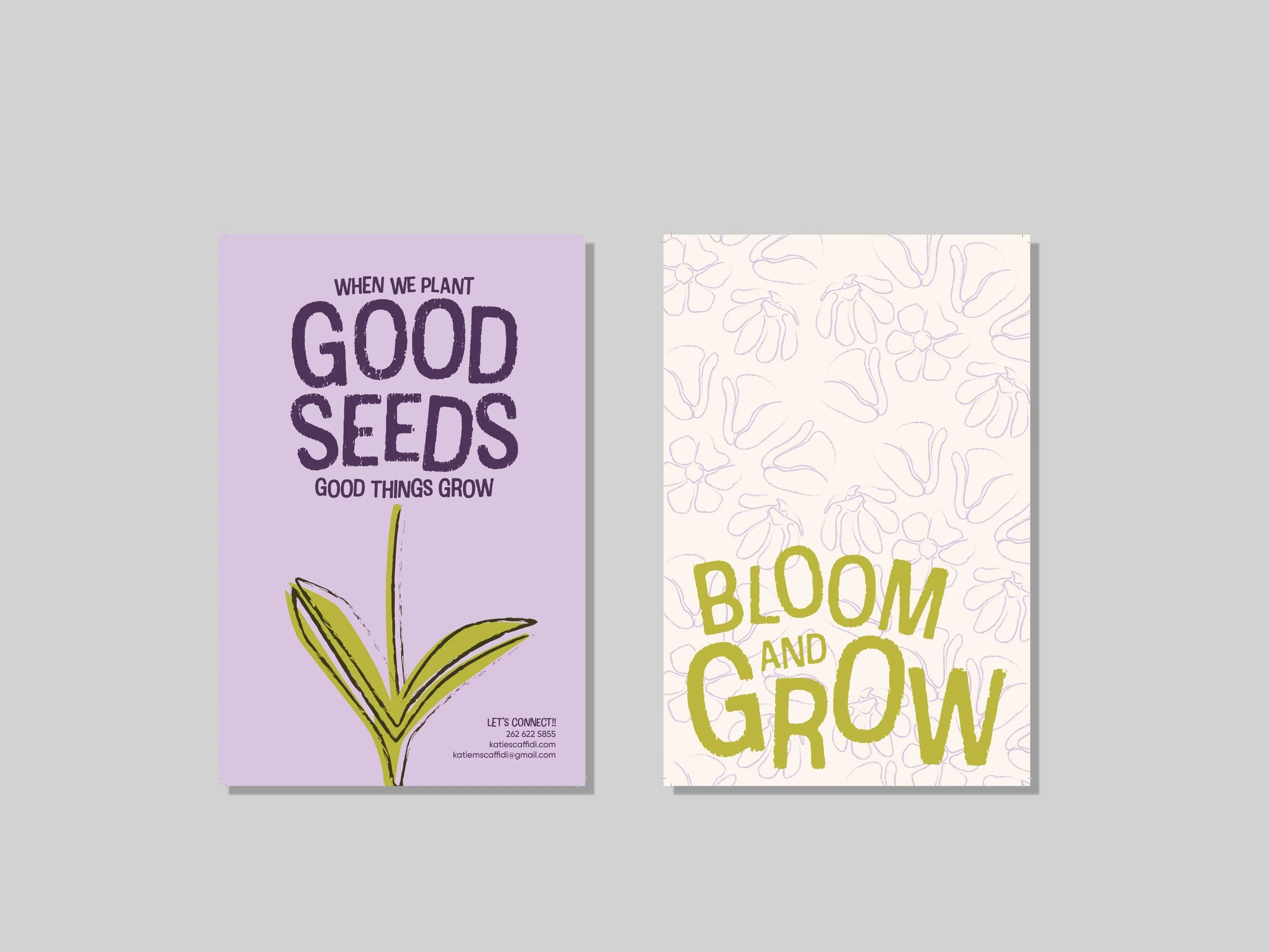
Growing Up is a personal bifold zine that serves as my introduction to the creative practice. Centered on the idea of growth, the flowers act as a visual metaphor for relationships and experiences that have shaped me and impacted how I create. Each hand drawn flower symbolizes individuality within a collective growth, represented as the bouquet. The bouquet doubles as a representation for flowers as appreciation and how they’re often an indication of big moments in life. Growing Up is a heartfelt reflection of my creativity, rooted in personal growth, experience, and collaboration.
FOCUSES
Typography
Illustration
Layout Design
2D & 3D Dimensionality
Creativity has shaped who I am from an early age, whether through imaginative thinking or hands-on artistic work. While growing up as an only child taught me independence, I’ve always been energized by collaboration and the exchange of ideas.
My focus is human-centered design, an approach grounded in empathy, problem-solving, and a deep understanding of user needs. I’m especially interested in supporting emerging brands and small businesses by helping them build authentic visual and marketing narratives that resonate and drive growth.
Through tools like journey maps, personas, brand analysis, and continuous feedback, I aim to understand both the client and their audience at every stage. Ultimately, I believe effective design starts with clarity: knowing what a business stands for and who it serves.
OVERVIEW
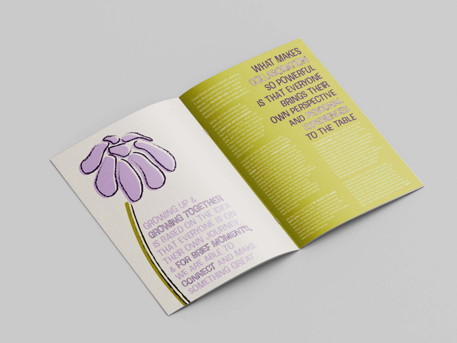
“Growing Up and Growing Together” embodies the idea that everyone is on their journey of life, and for brief moments, we are able to connect and make something incredible. We are all growing into our best selves and creating for others in the process. I am honored to be a small part of my clients’ journeys, and to see how they flourish.
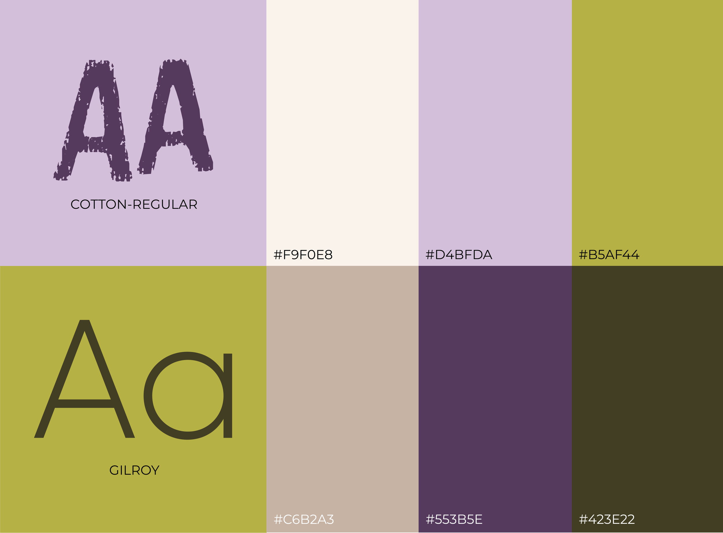
Font: I chose the font Cotton because of its embodiment of texture, growth, and organic movement; this font is juxtaposed with a sans serif font to add a sense of clarity and modernity, balancing creativity with professionalism.
Layout: The layout mimics the natural flow of nature- the text curves around the stems, and key phrases are accentuated by color and the decorative font to create typographic and visual hierarchy.
Color: The color palette reinforces the sense of calm and an inviting nature, which represents my work with clients.
BRANDING
FINAL ASSETS
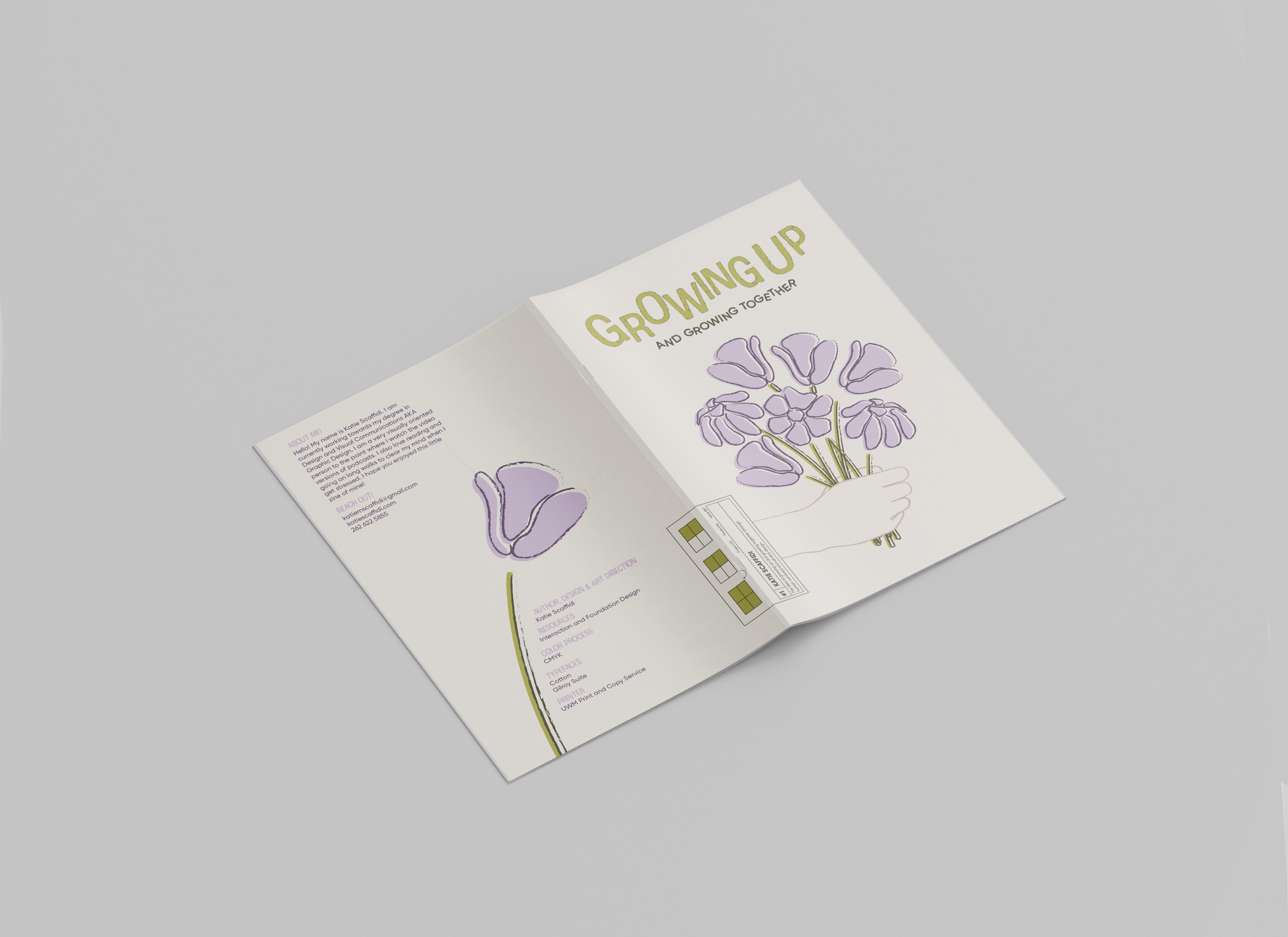
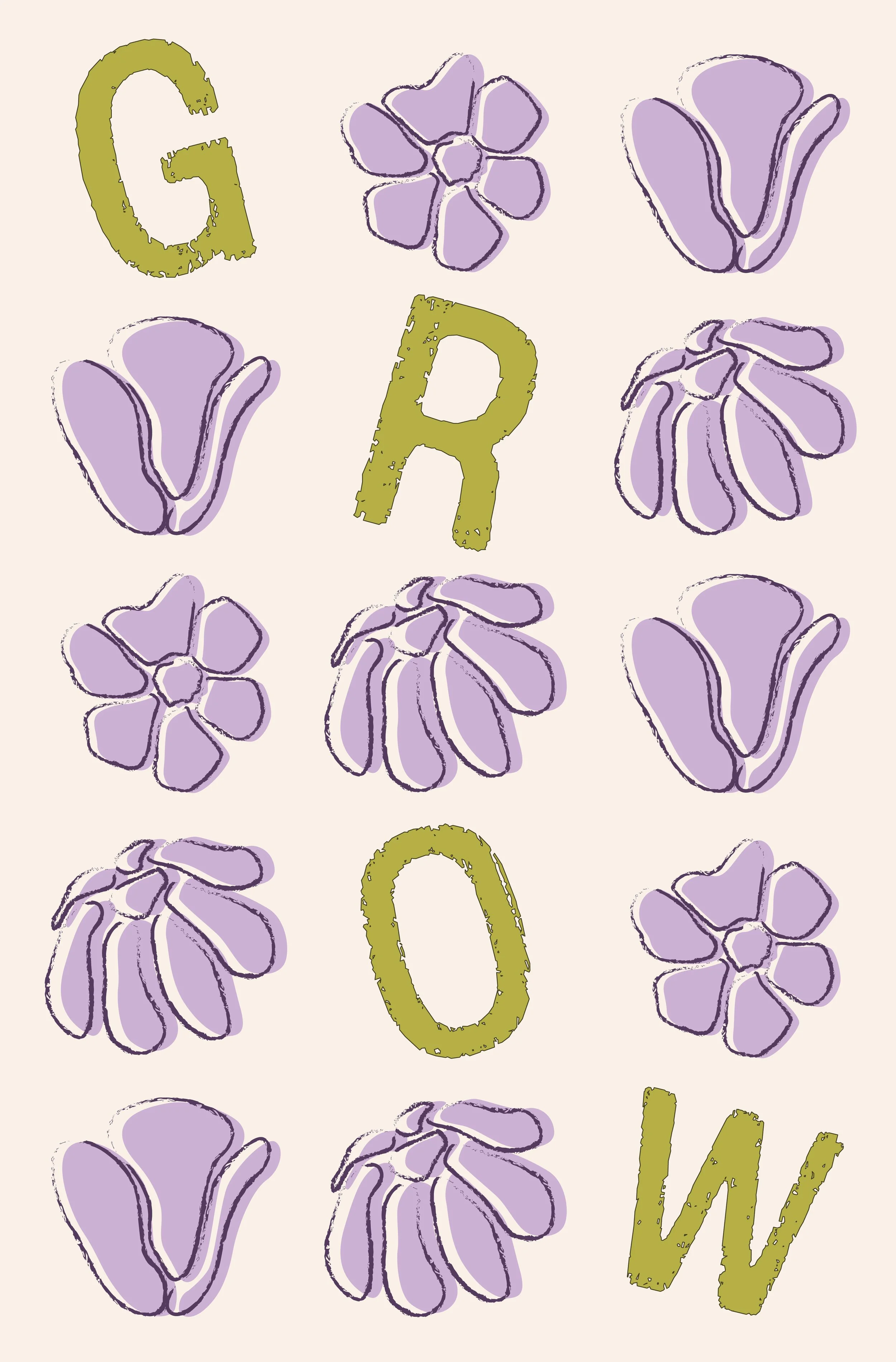
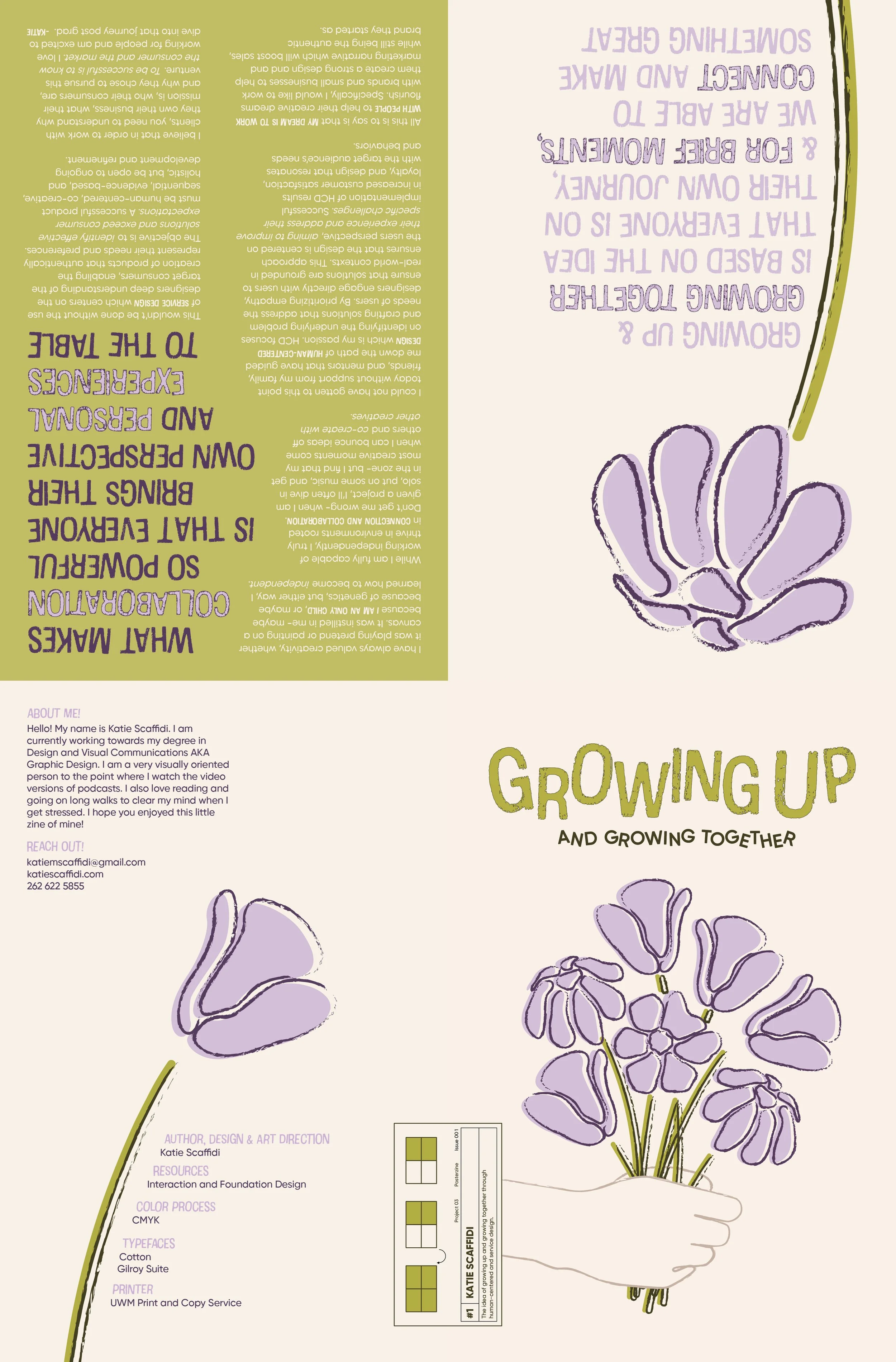
In this project I had to look within and assess who I was as a designer, and who I wanted to be. I started with a writeup of content first, because that would then impact the design. Figuring myself out, and declaring this as my introduction to the design community was a daunting task, but it felt very rewarding once the words were written, and I realized that I aligned so heavily with certain types of design. Flowers here have a multiplicity of meanings and they have since become part of my personal branding as well because they encapsulate ideas such as growth, individuality, beauty, big moments in life- they are this ever evolving being that stays resilient through thick and thin, something I strive to be.