

Mod Gen Rebrand
Tasked with shifting Mod Gen: A Modern General Store from the explorer archetype to the creative archetype, this rebrand encapsulates innovation, self-expression, bold color, and urban growth. The goal was to position Mod Gen, not just as a plant and handmade goods store, but as a hub for creatives.
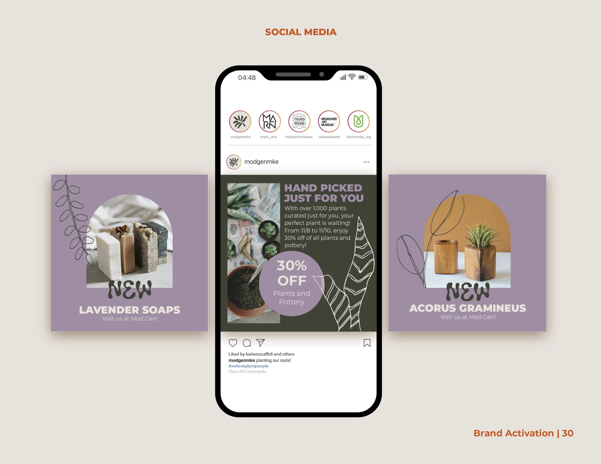
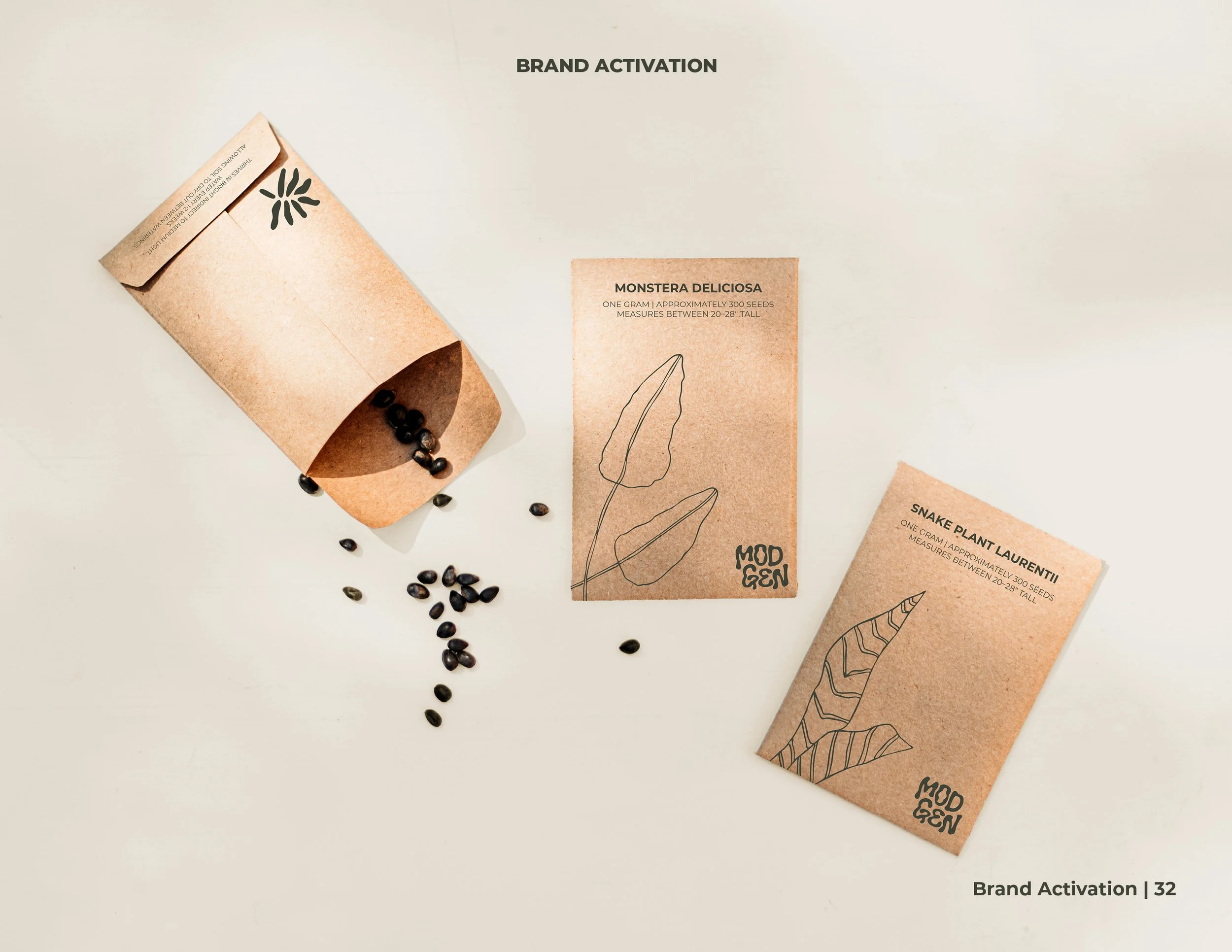
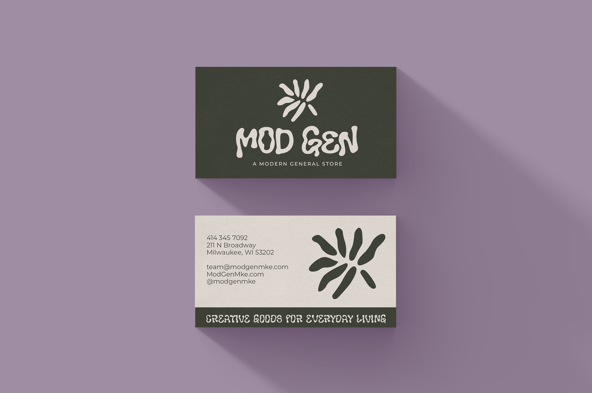
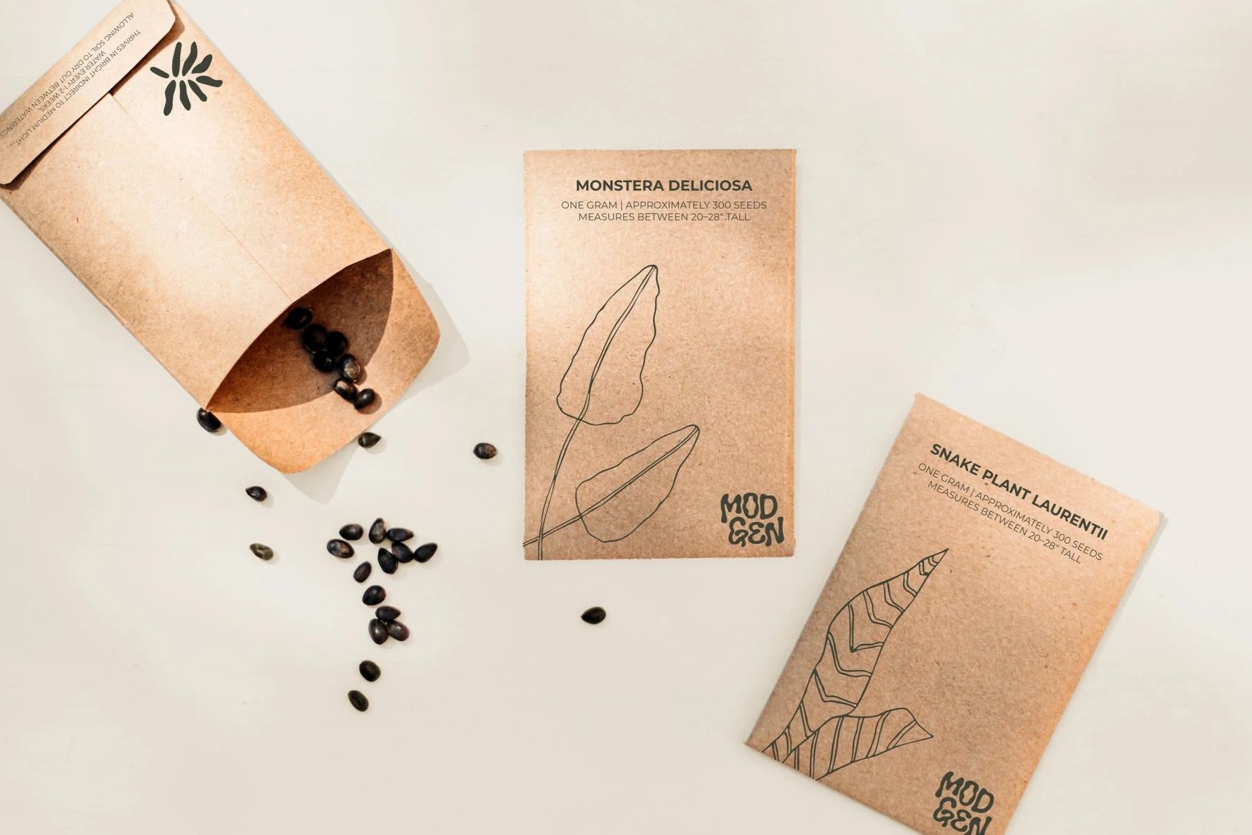
To show how the brand functions in real life, I applied the branding across social media and web platforms, as well as seed packets and business cards.The new brand identity helps Mod Gen feel fresh, creative, and connected to its urban environment while staying true to its roots.
CLIENT
Mod Gen: A Modern General Store
FOCUSES
Branding and Visual Identity
Social & Web Design
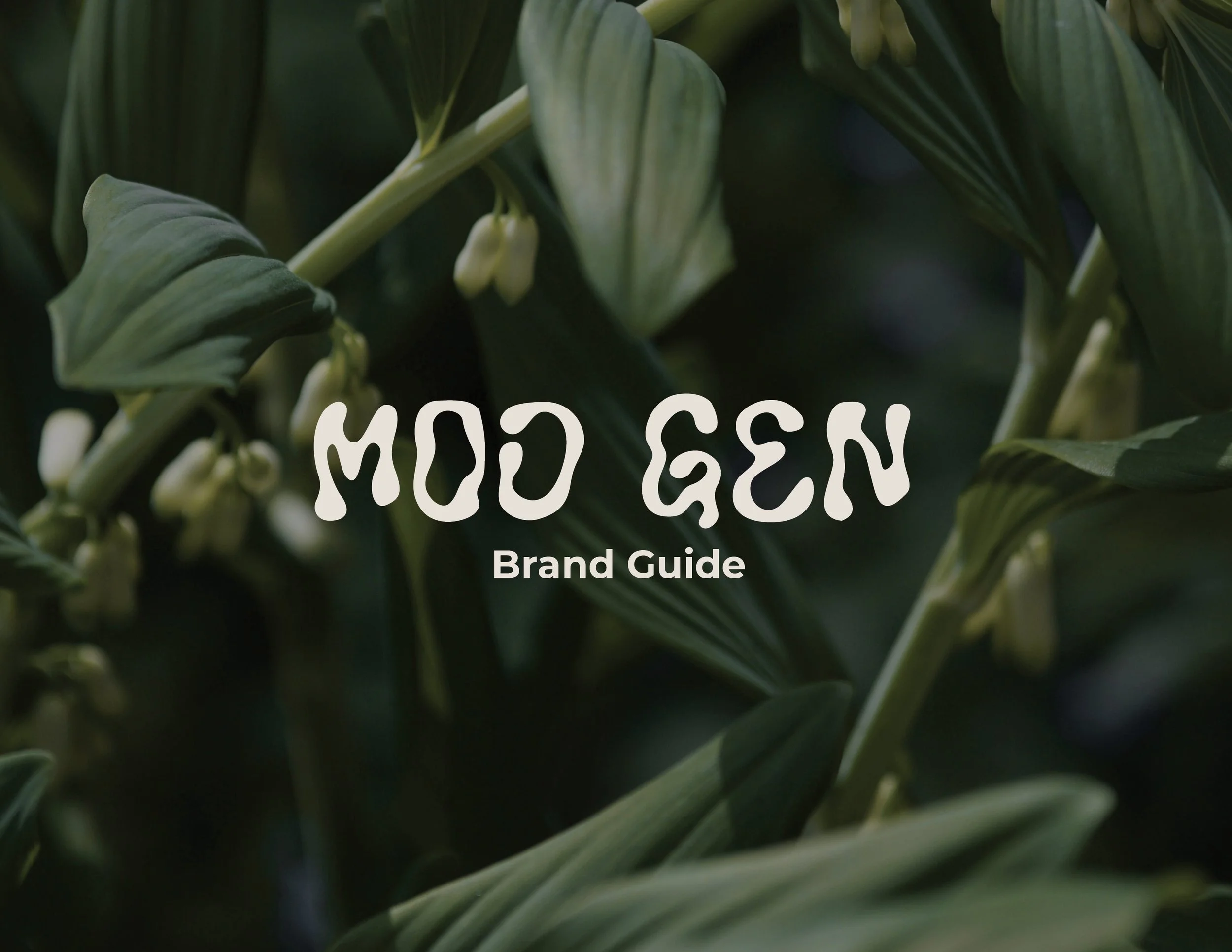
Brand Guide
Color Theory
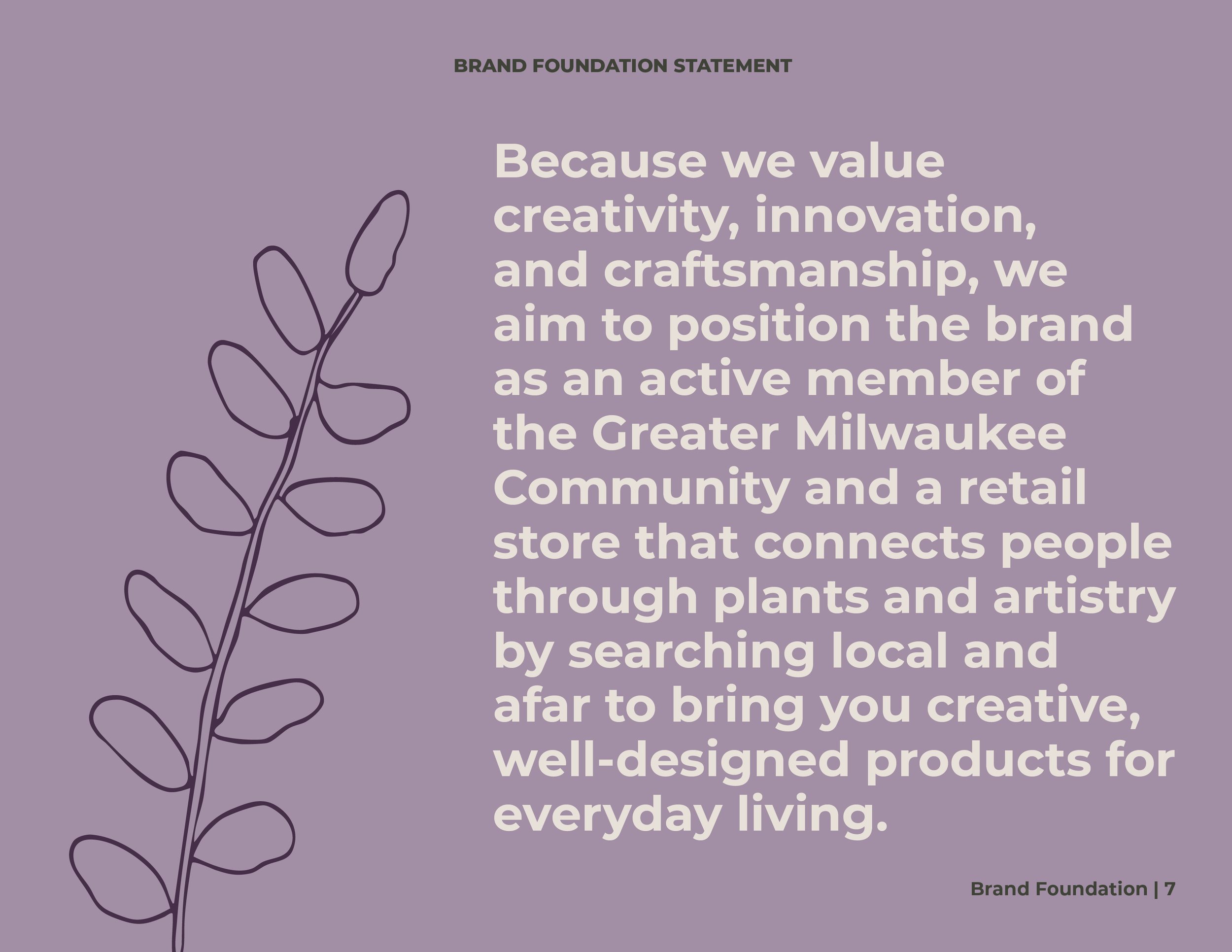
Revised Brand Foundation: Because we value creativity, innovation, and craftsmanship, we aim to position the brand as an active member of the Greater Milwaukee Community and a retail store that connects people through plants and artistry by searching local and afar to bring you creative, well-designed products for everyday living.
Creative Archetype: The creative archetype values creativity, innovation, craftsmanship, and a strong vision. Creator brands encourage self-expression and originality. Their designs are aesthetically pleasing, using creative fonts and unique color palettes.
OVERVIEW
BRANDING
Logo: Combines natural and organic feel with an urban setting
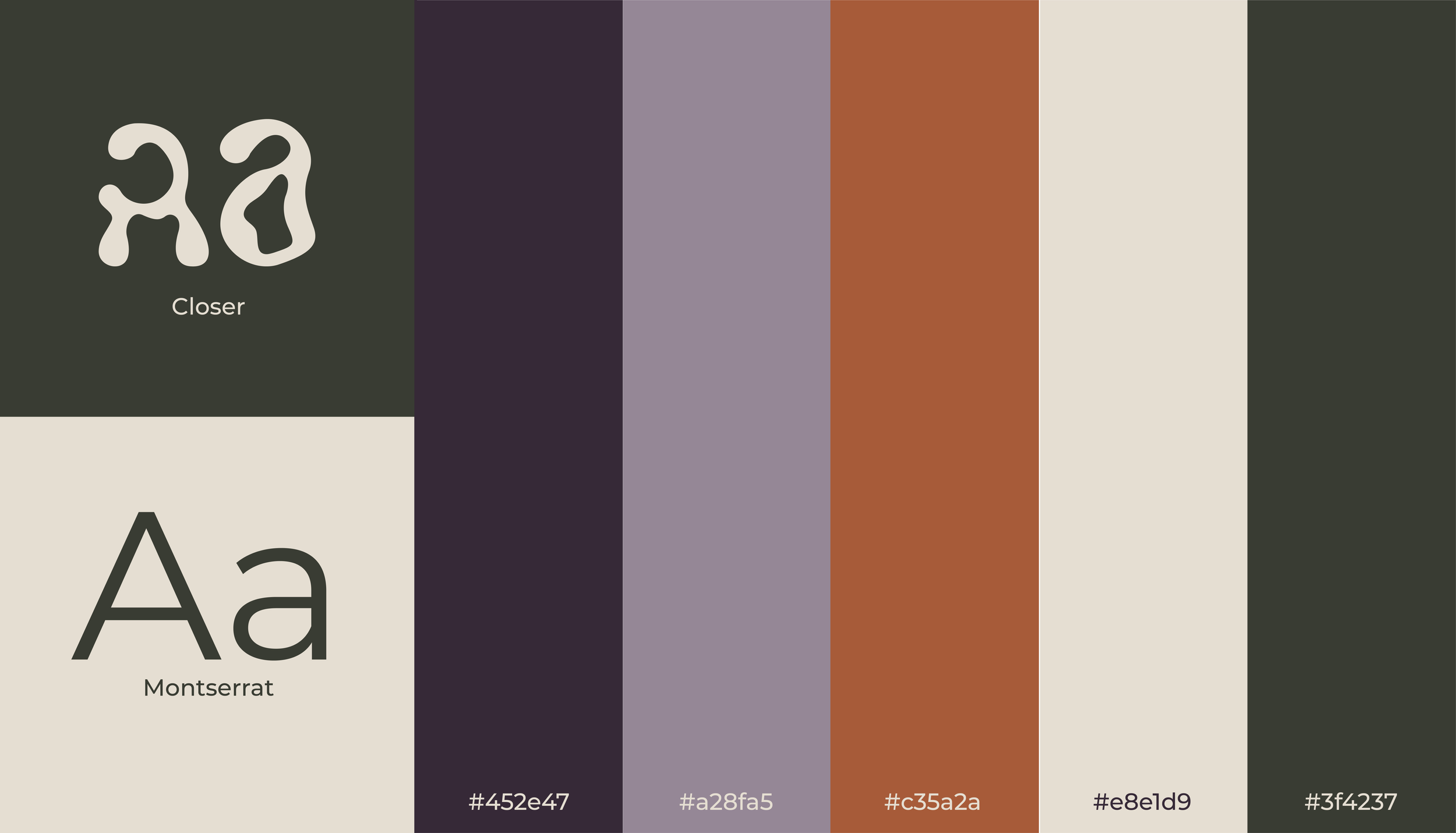
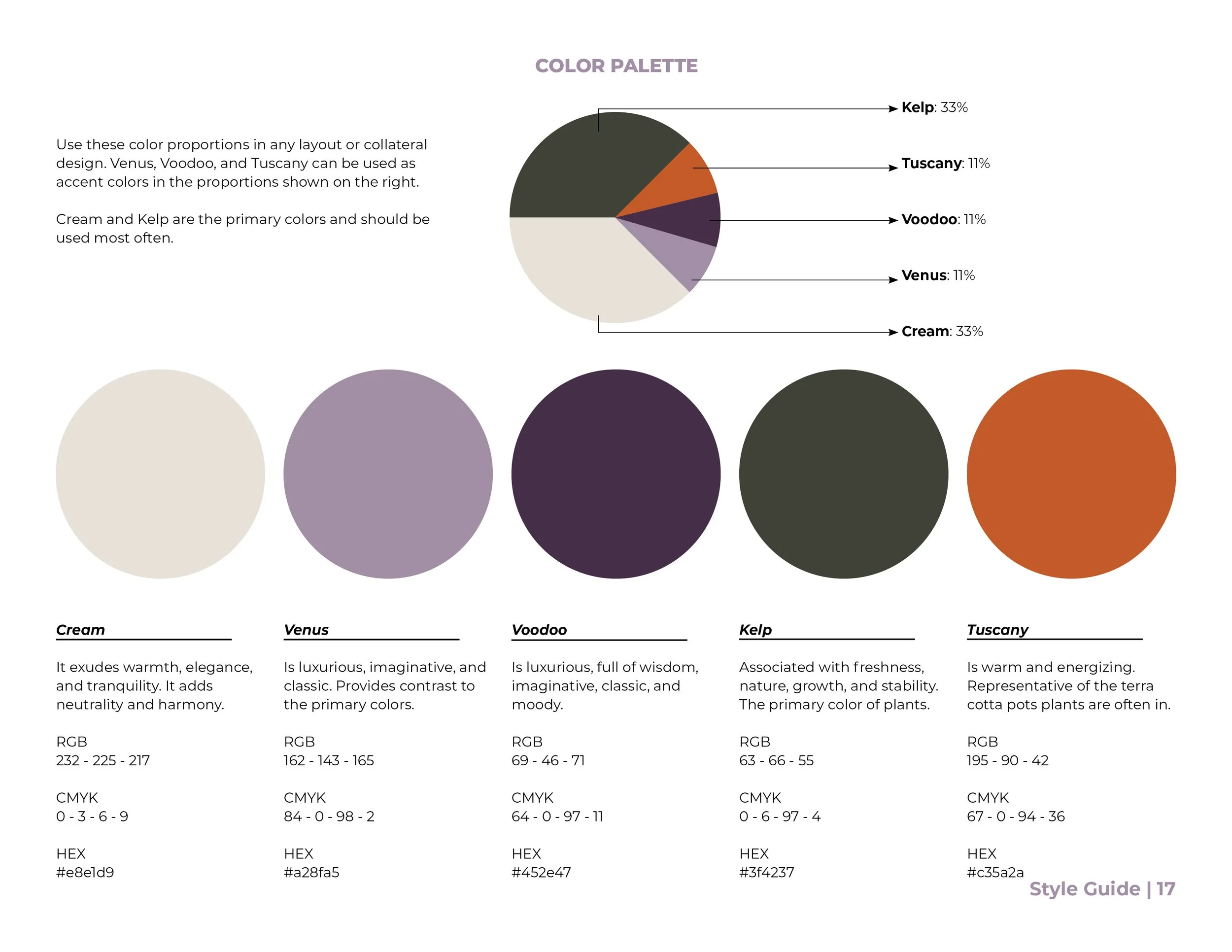
Color Palette: The color palette with neutrals, green and cream, are paired with rich purples and a pop of bold orange to capture the vibrancy of creativity and the neutral tones of plants.
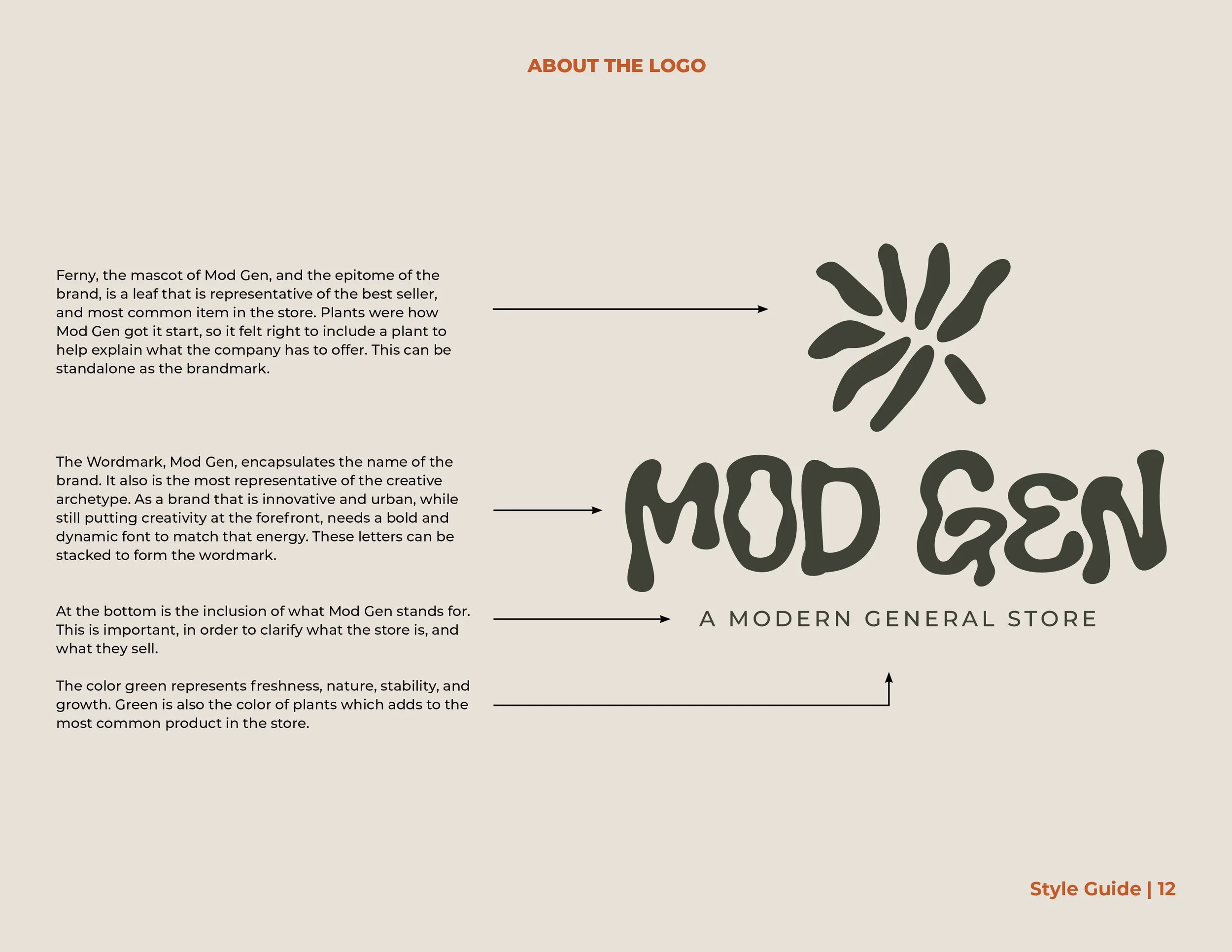
Green: Associated with freshness, nature, growth, and stability; the primary color of plants.
Orange: Warm and energizing; the well-known color of terra cotta planters.
Cream: Warmth and elegance; adds neutrality and harmony.
Purples: Luxurious and full of wisdom; classic and moody and provides contrast.
LOGOS
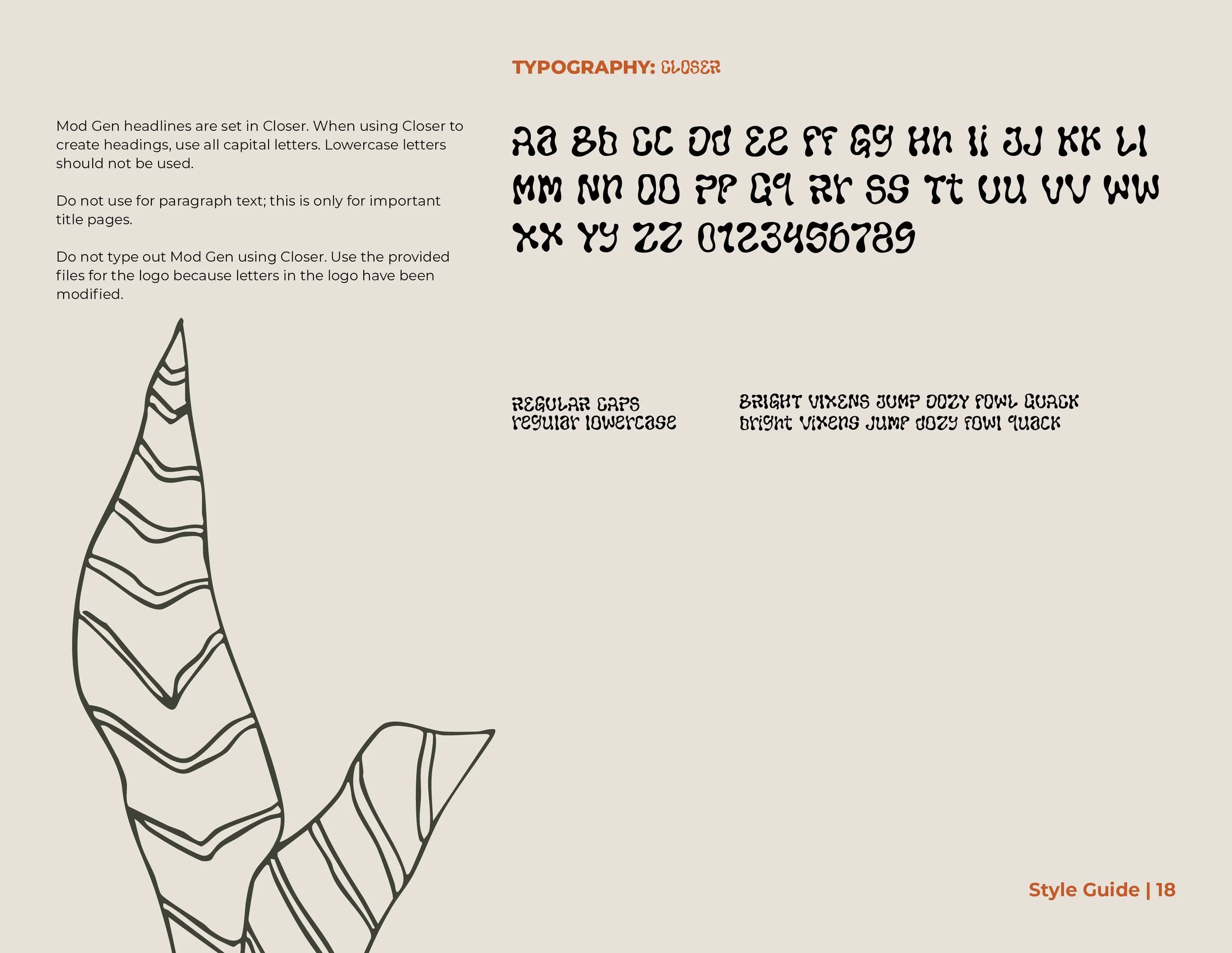
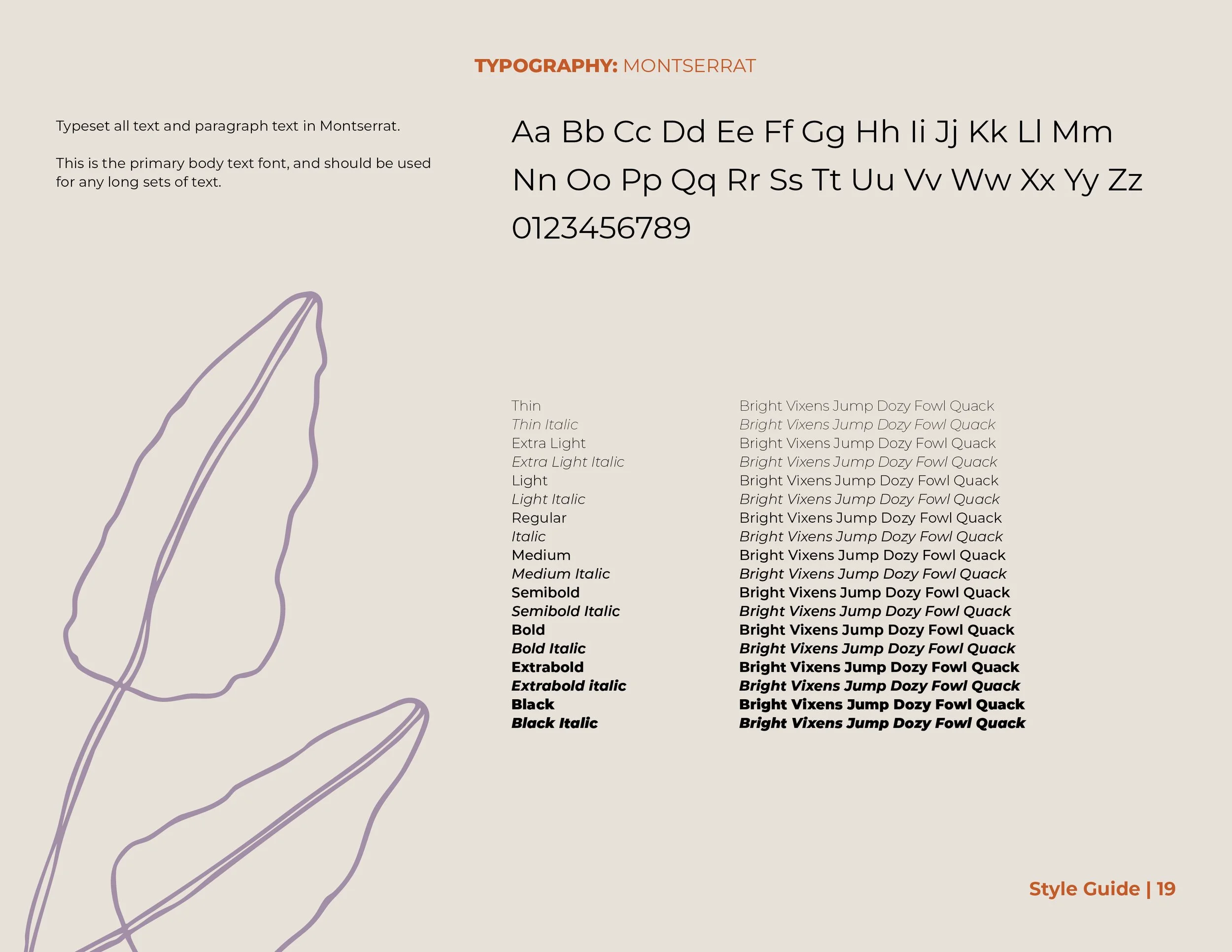
Type: The font Closer embodies organic shapes and its handmade qualities mirror the brands roots in nature and craft. Paired with a clean sans serif font, the typography balances creativity and modernity.
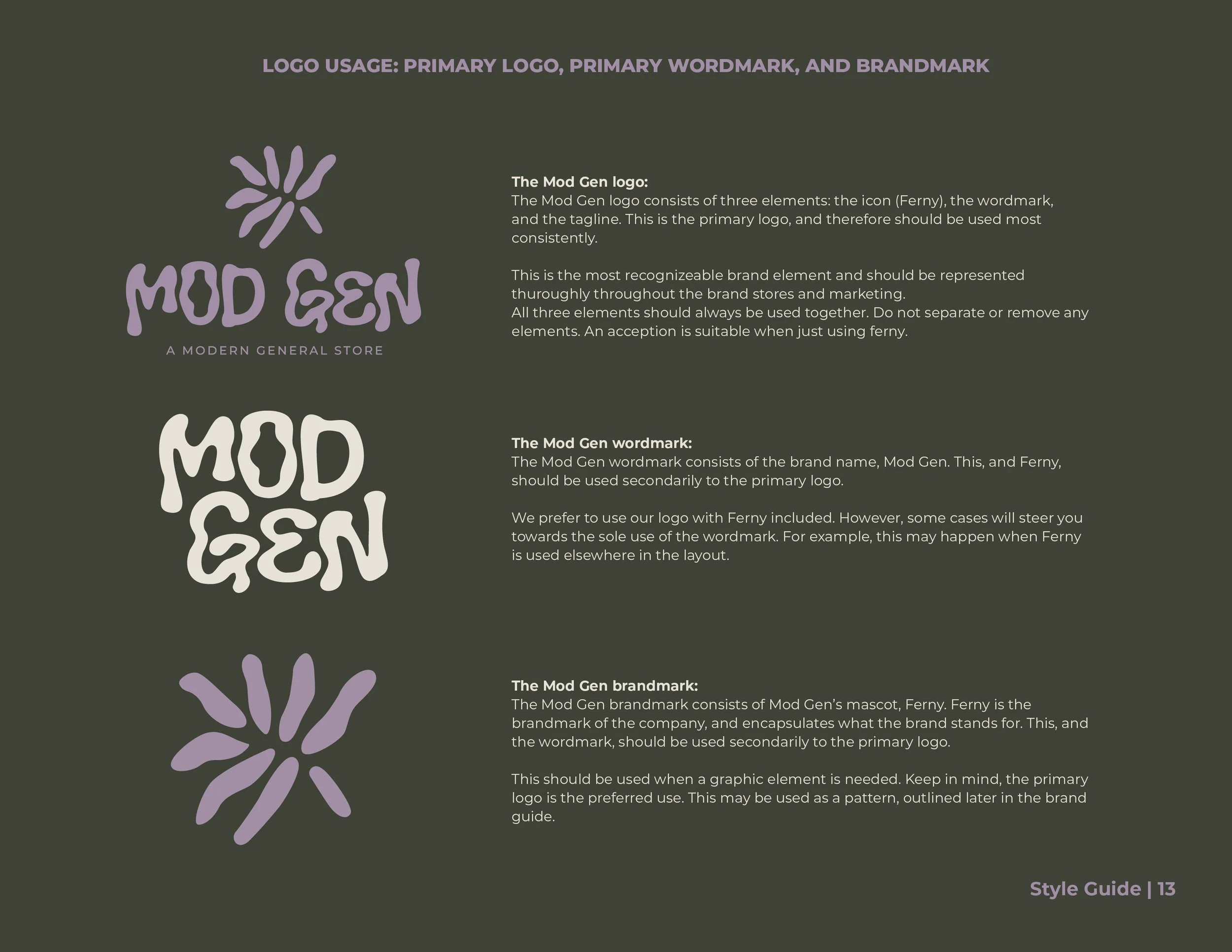
Ferny The Leaf (AKA The Mascot): Ferny is the epitome of the brand and is the best seller/ the most common item in the store. Plants are how Mod Gen got its start, so it felt right to add a plant to help explain what the company has to offer. Standalone, this is the brandmark.
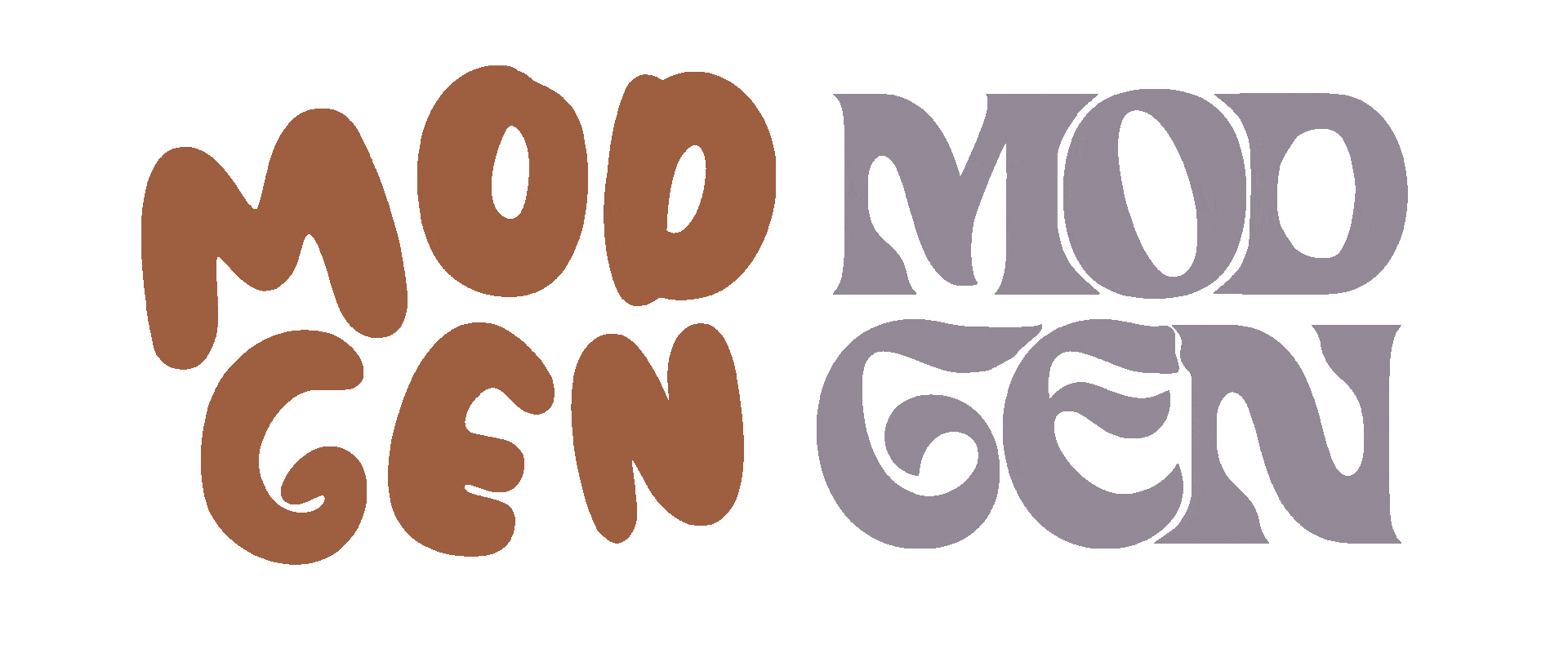
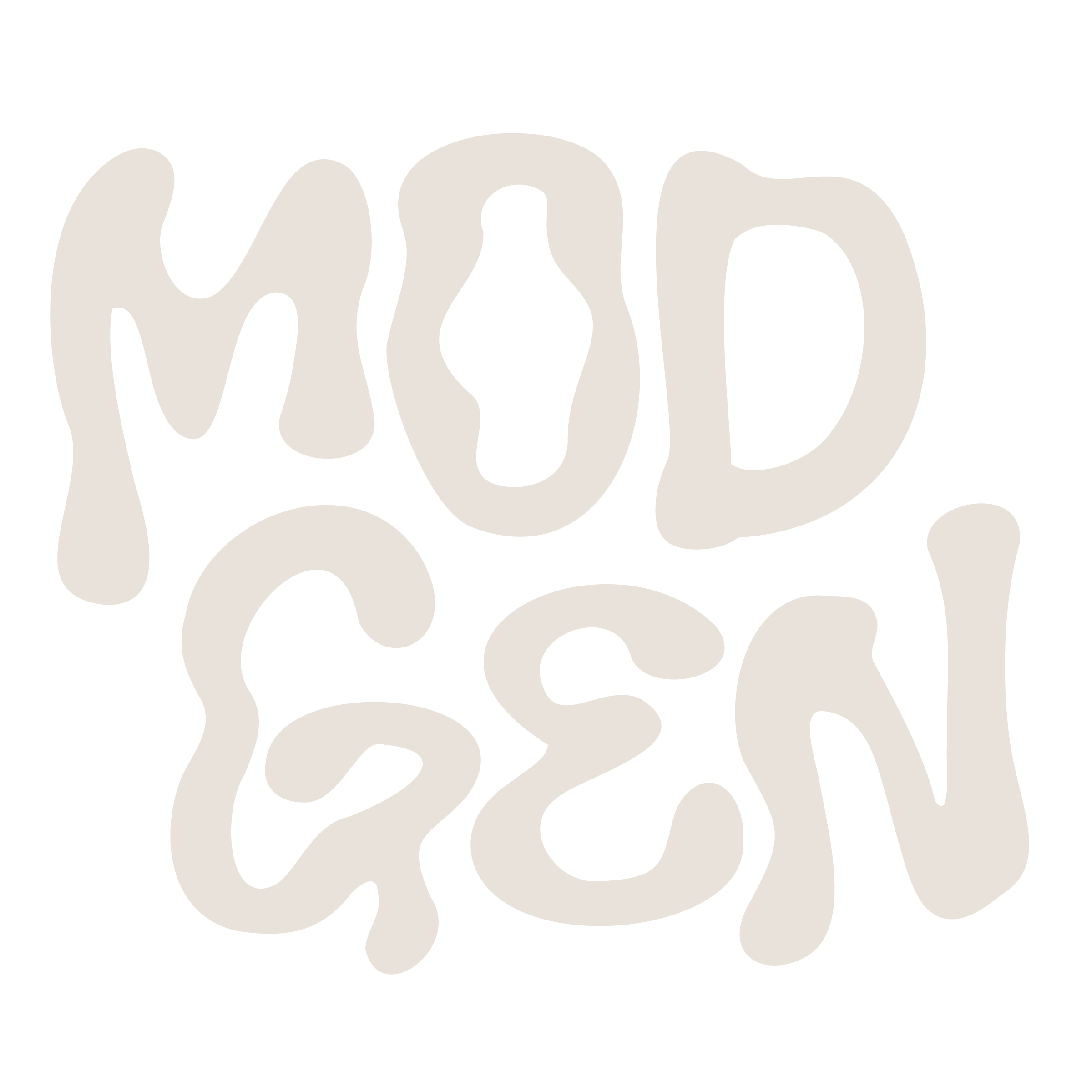
The Wordmark (Mod Gen): This encapsulates the name of the brand and also best represents the creative archetype. As a brand that is innovative and urban, while still putting creativity at the forefront, needs a bold and dynamic font to match that energy. These letters stacked are the makeup of the wordmark.
The Tagline (A Modern general Store): This is important to clarify what the store is and what they sell, to understand what Mod Gen means.


BRAND GUIDE


PRINT MEDIA


DIGITAL MEDIA


This encapsulates my first brand guide and constitute elements, in order to reposition an existing brand to an new archetype while still honoring the existing brand and their values. An important part of the process was research- I went into the store, talked to employees, and even reached out to the owners to receive more information on the start o the company, all to make sure I was honoring the company correctly. I couldn’t have done this without research and taking the extra time at the beginning to understand the client from all angles. This project taught me how to not only make a brand guide, but read other brand guides, something essential to design practice. I learned about all of the different assets that could be helpful to clients in the future. I’m honored to help companies reposition and/or brand themselves and am excited for the new ventures that lie ahead.